


Reimagining a new energy brand from the ground up by translating strategy, branding and research into a cohesive digital experience.
Client: SMS plc
Industry: Renewable Energy
Duration: 6 months
Role: Lead UI Designer
Team: Brand, UX, Product, Engineering
UX/UI
Design Systems
Brand Translation
Illustration
Responsive Design
My role was to ensure the evolving identity could become a coherent digital experience, As Lead UI Designer, my role was to translate an evolving brand into a cohesive digital product.
Working across UI, design systems, illustration and accessibility, I ensured every touchpoint expressed the same visual language while collaborating closely with Brand, UX and Engineering.
Throughout the project my role evolved alongside the brand itself, helping shape how strategy became a product experience.
Initially, CI&T were invited to design and build a responsive website for the launch of Metis, a new consumer-facing renewable energy brand created by SMS plc.
However, conversations with stakeholders quickly uncovered a much bigger opportunity.
The existing brand direction felt safe, but lacked the personality and distinctiveness needed to stand apart in an increasingly competitive market. Rather than simply designing pages, we began rethinking how the entire brand could be experienced digitally.
Our role shifted from delivering a website to defining a new brand that would help people understand, trust and engage with Metis for the first time.


Research showed that affordability wasn't the biggest barrier. Understanding was. People found renewable energy
Confusing.
Technical.
Overwhelming.
Even when solutions were financially accessible, users struggled to understand costs, installation and long-term value.
The challenge wasn't simply communicating information. It was making renewable energy feel approachable.
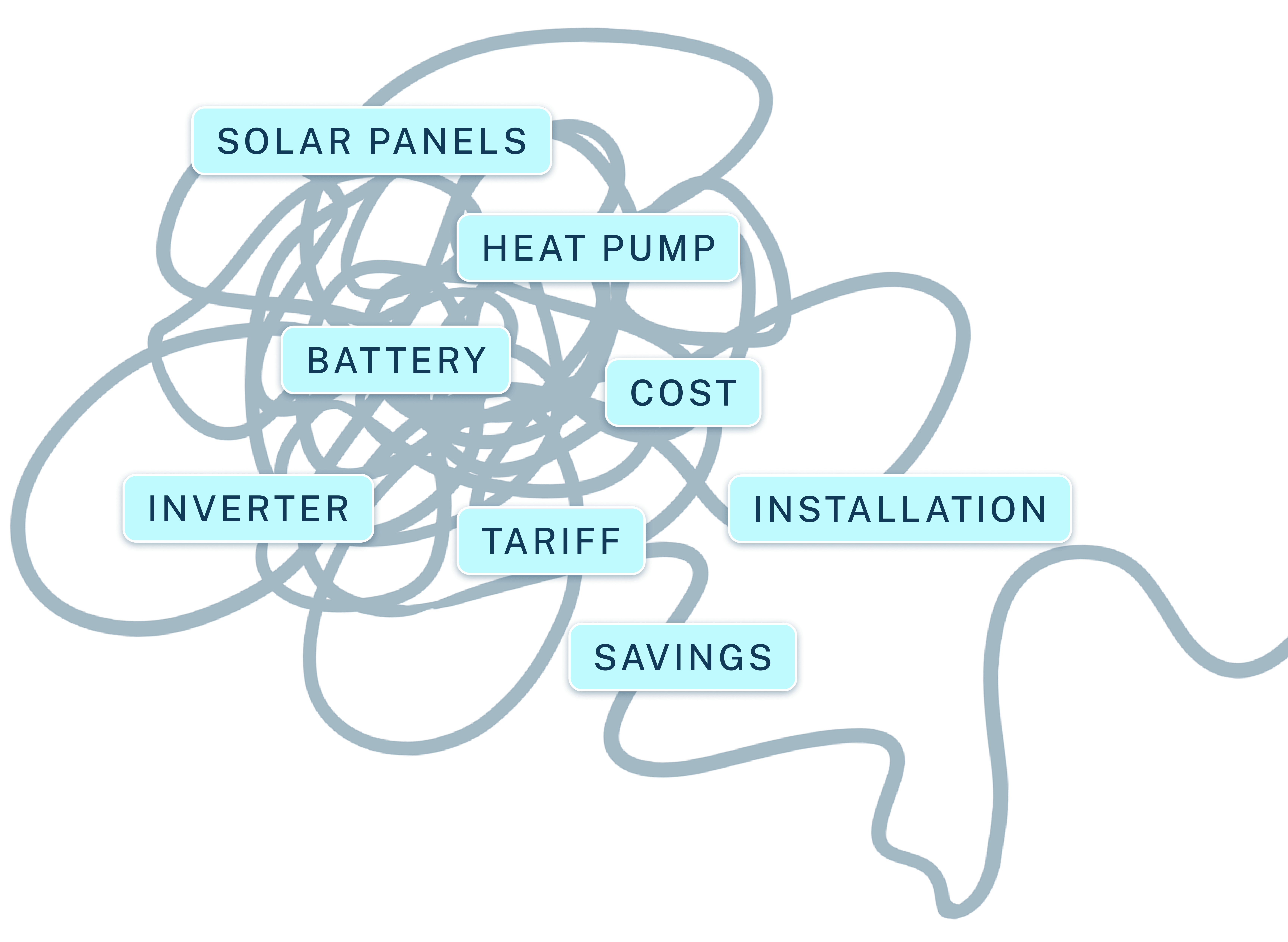
Through a combination of qualitative interviews and market research, we explored how people understood renewable energy, where uncertainty existed, and what prevented them from taking the next step.
Those insights became the foundation for the experience that followed.

Users struggled to understand pricing, installation and technical terminology.

The category felt distant and overly technical, creating hesitation even when the proposition was attractive.
Research suggested the experience needed to balance two complementary qualities.
On one side, users needed reassurance that Metis was trustworthy, transparent and knowledgeable.
On the other, the brand needed enough warmth and optimism to inspire confidence in a cleaner future.
Those two principles became the foundation for every design decision that followed.
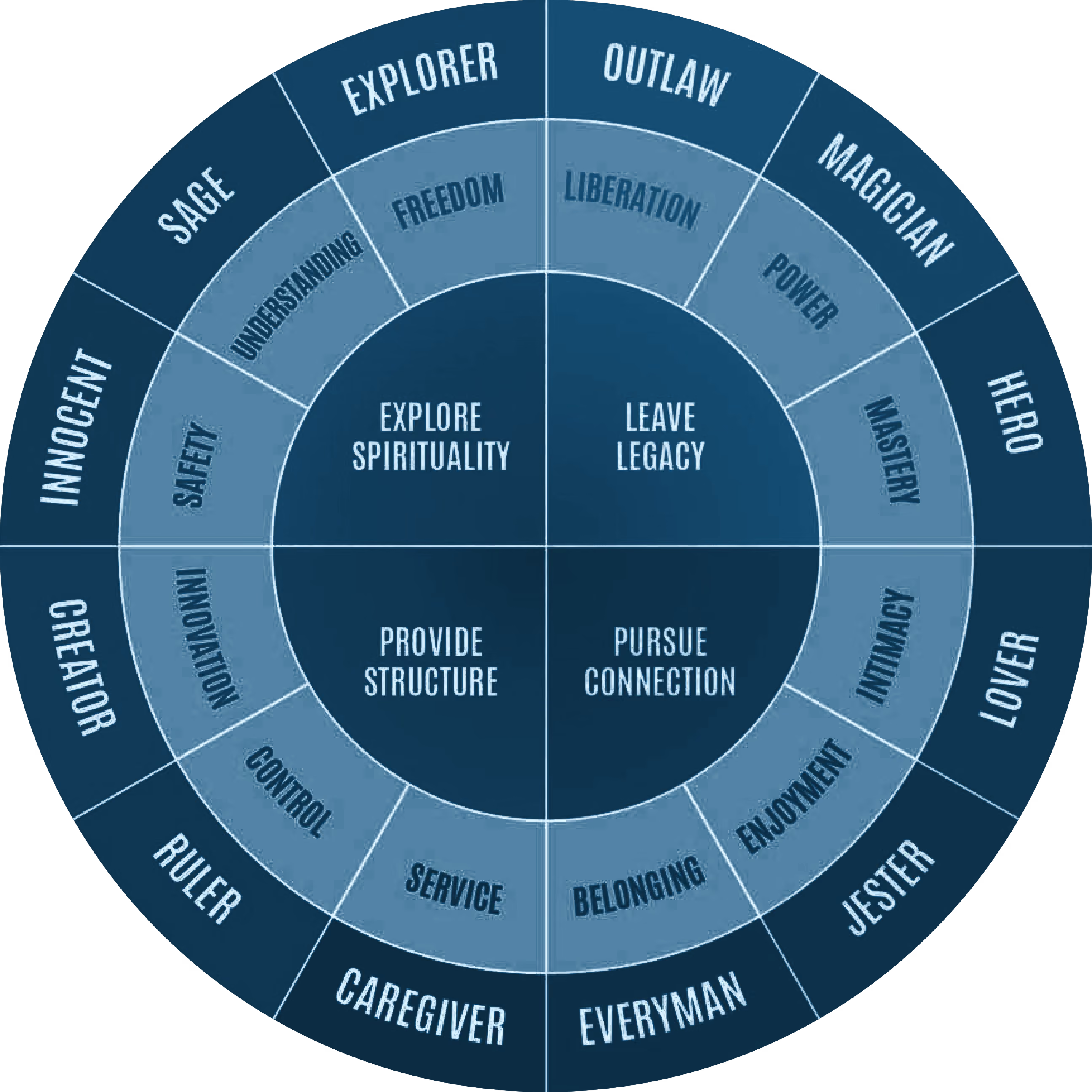
Before exploring visual execution, we needed a shared understanding of who Metis Were.
Working closely with the client through collaborative workshops, we used brand archetypes to explore the different personalities the brand could adopt.
Rather than beginning with colours or typography, we aligned on character first, ensuring every touchpoint expressed the same personality.
Together, we narrowed these down to three distinct directions: The Sage, The Hero and The Magician before using them as a framework to guide the evolving visual identity.
With three brand archetypes identified, the next step was exploring how each could be expressed visually.
We developed three distinct creative routes, each interpreting a different personality through colour, typography, composition and illustration.
Presenting these directions back to the client allowed us to evaluate not only how Metis looked, but how each route felt.
Together, we refined the strongest ideas into a single visual direction, ultimately embracing the qualities of 'The Sage' as the foundation for the evolving brand.
Over time 'The Sage' route became more defined, This allowed for the other two routes to be retired.
The chosen direction balanced warmth with clarity, helping renewable energy feel approachable without losing credibility. A bold colour palette and vibrant gradients introduced optimism and energy, while the Blimp typeface brought a more welcoming, conversational tone.
A flowing graphic device, supported by curated imagery, became a visual thread throughout the experience, symbolising the connections between people, their homes and the wider energy ecosystem.
Illustration
We ran into an issue with content this was a new offering to the market, therefore we had no photography to work with.
Stock imagery was too generic and we were unable to rely on AI generated imagery as the image inconsistencies were noticible and didnt come across as trustworthy. we needed a different approach
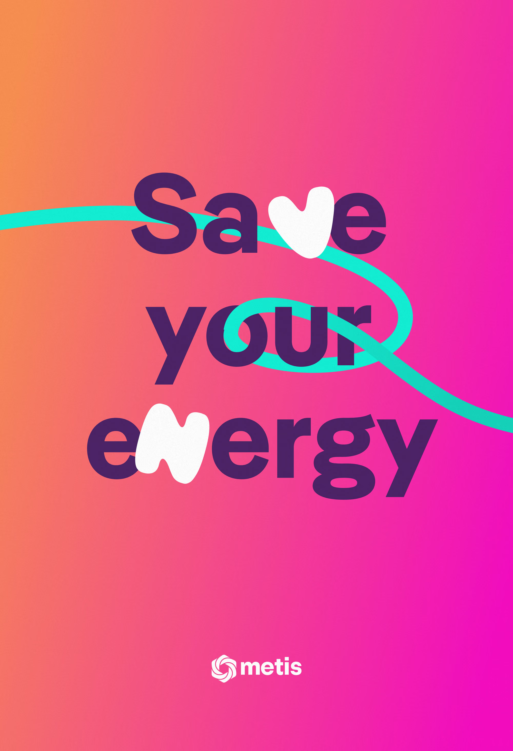
Therefore working closely with the wider team, I developed a bespoke illustration style that balanced clarity with personality, reinforcing the wider brand rather than competing with it.

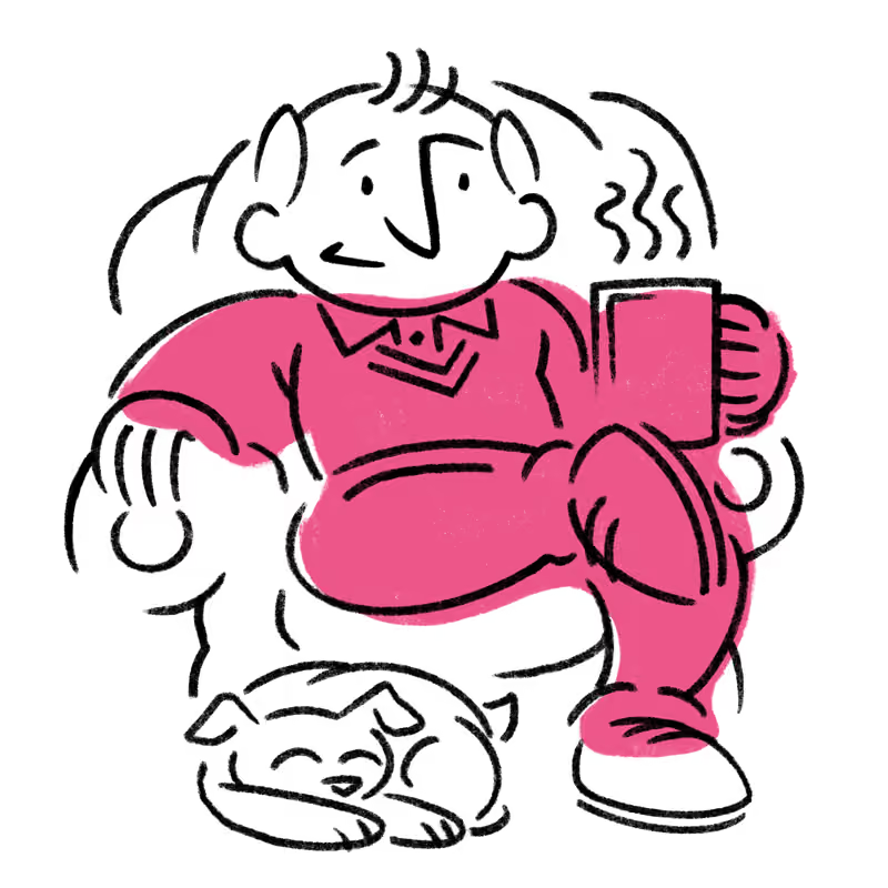



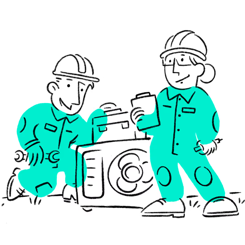

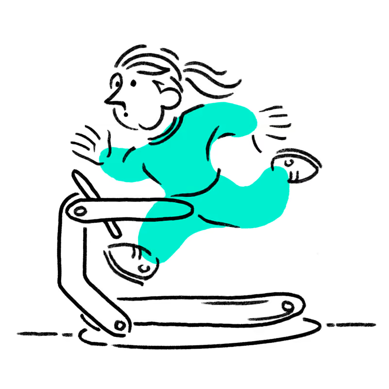

Illustration
The illustrations weren't created simply to stand in for photography, they acted as a focal point to make the interface more engaging. They became a storytelling tool.
Their role was to make renewable energy feel human, optimistic and approachable while supporting key messages throughout the experience.
The result wasn't simply a library of illustrations, but a scalable visual language that made complex energy products feel more approachable and recognisably Metis.
UX/UI
With the foundations of the brand beginning to take shape, the next challenge was understanding how it would behave as a digital product.
Rather than simply applying the emerging identity to interface designs, the UI became a space for exploration. We deliberately pushed the visual language, testing where it felt confident, where it became overwhelming, and where it struck the right balance.
Those explorations helped define not only how Metis looked, but how it felt to use.
By this stage, the personality of the brand was beginning to feel established. The challenge shifted from exploring possibilities to applying those ideas consistently across a growing digital product.
Only once that balance had been found did it make sense to stop exploring and begin building a scalable product.
UX/UI
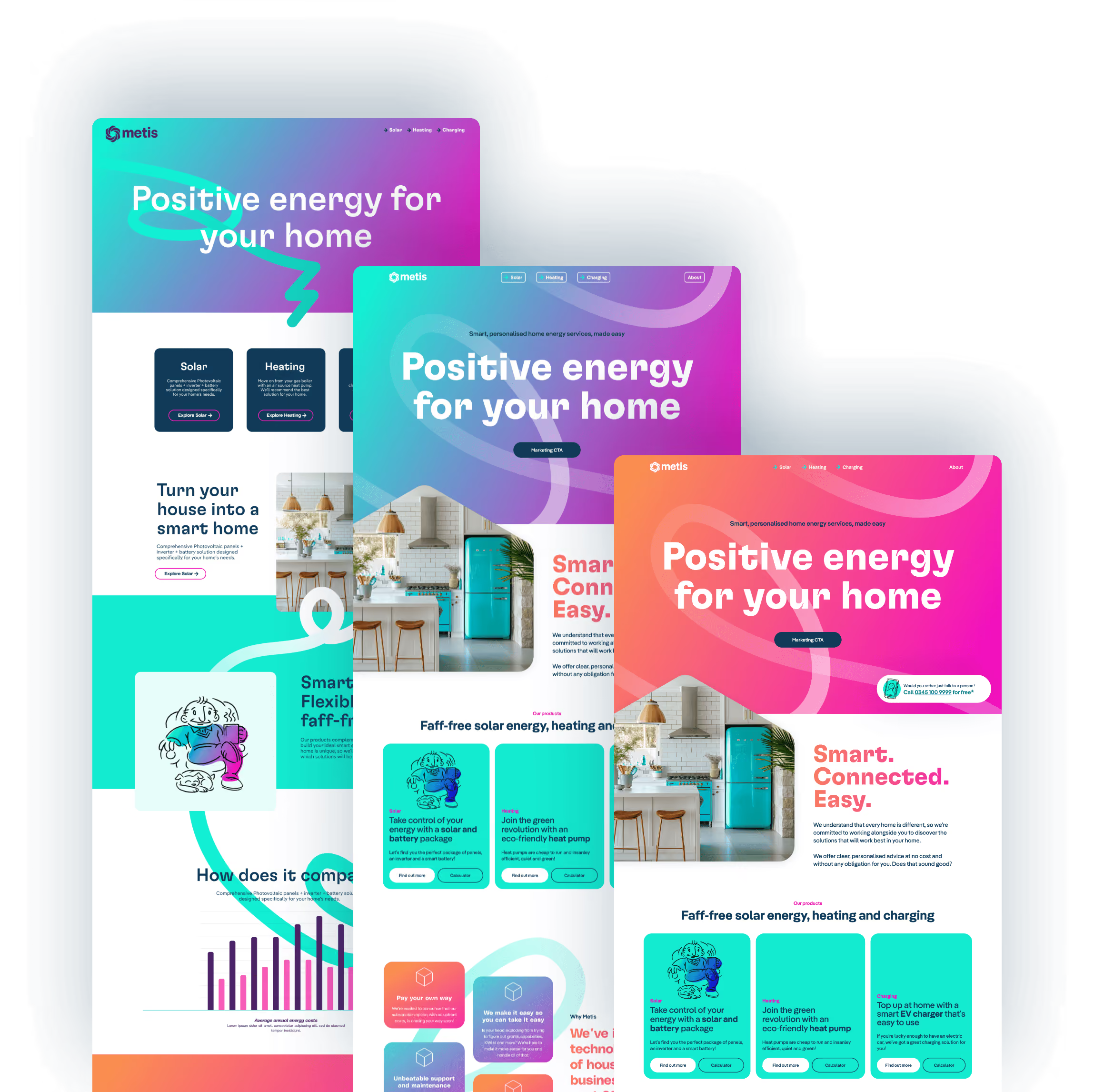
Once the strategic direction had been established, focus shifted to translating the identity into a coherent digital experience.
Rather than treating the UI as a layer applied at the end, every element of the interface became an extension of the brand itself.
By developing the interface alongside the evolving brand, every touchpoint reinforced the same personality rather than feeling like separate pieces created in isolation.
UX/UI
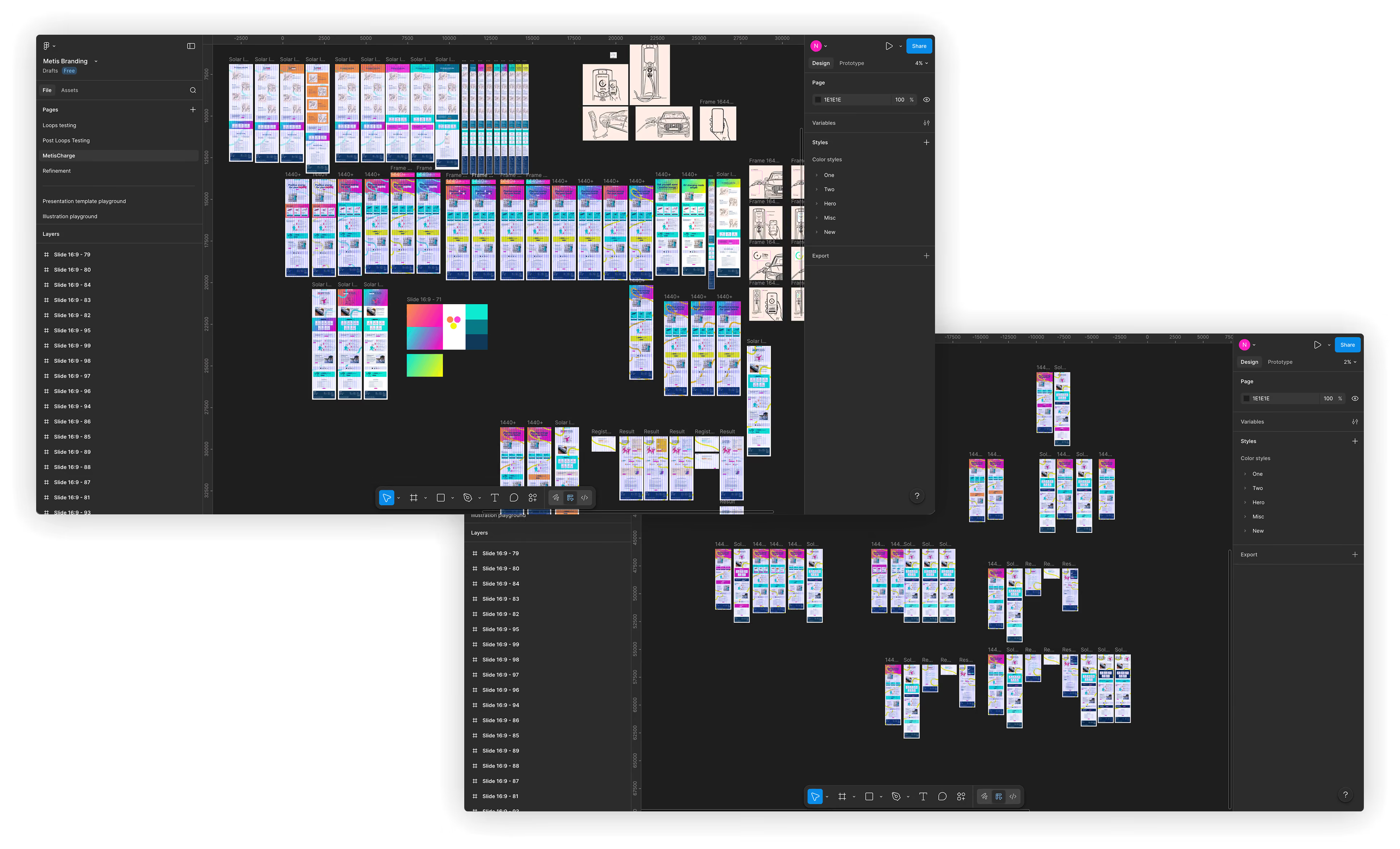
The interface evolved through rapid iteration, exploring different approaches before refining them into a consistent system that worked across every touchpoint.
Working closely with UX and development, each screen balanced clarity, accessibility and personality while remaining faithful to the wider brand.
Design Systems
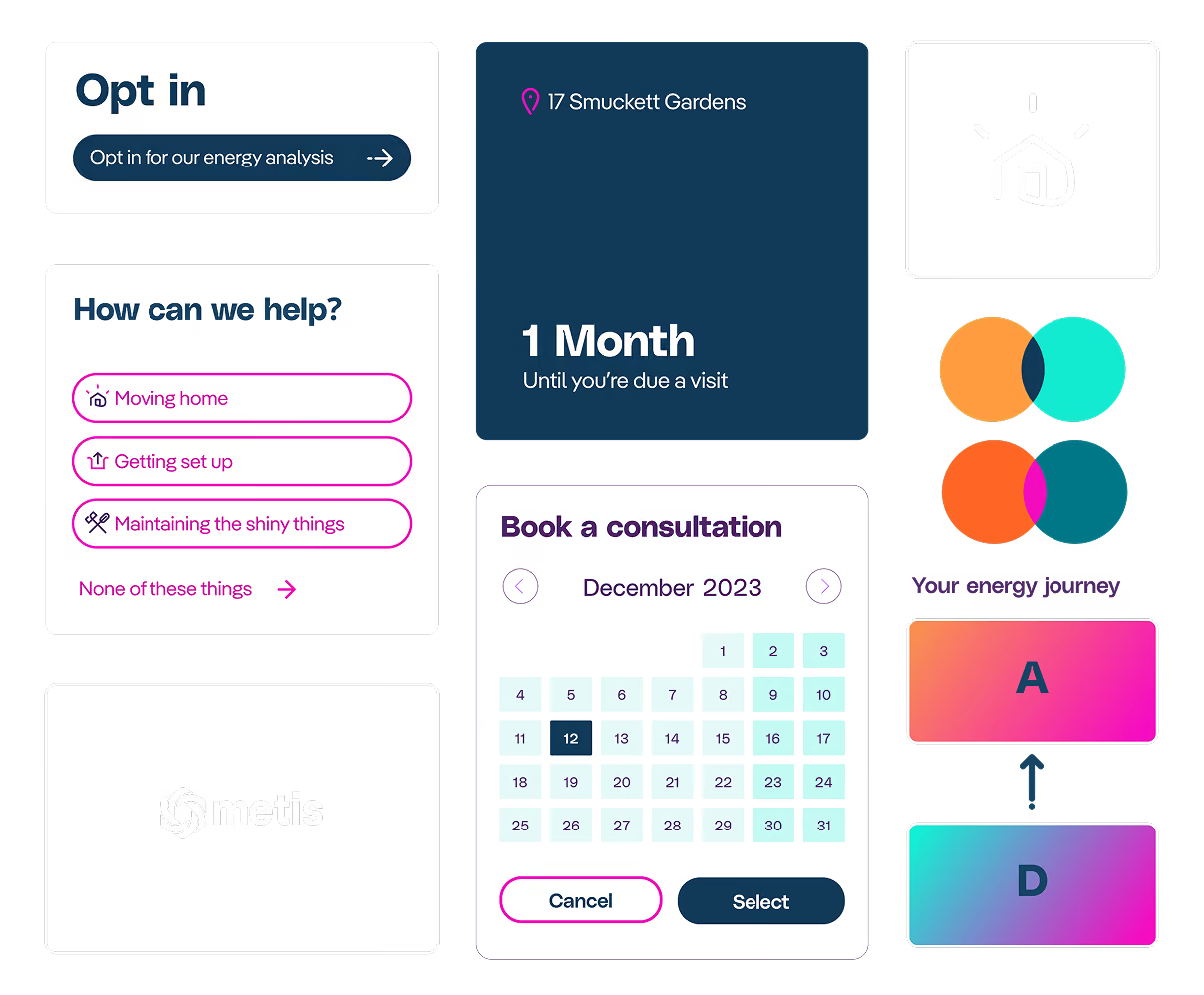
We deliberately prioritised exploration over rigid structure in the early stages of the project. As the visual language matured, patterns began to emerge across typography, layouts, illustration and interaction.
The design system wasn't the starting point, it became the framework that captured these decisions, allowing the product to scale while preserving the personality we'd worked hard to establish.
Metis reinforced something I've found throughout my career. The most rewarding part of design isn't refining interfaces, it's helping ideas discover their identity before translating them into products people can trust. Working across branding, UI and illustration allowed every discipline to strengthen the others rather than exist in isolation.
UX/UI
BRANDING
MOTION
A secure AI system giving factory workers instant, reliable access to the right knowledge, helping businesses work faster with less downtime. Designed to support people, not replace them.
View ProjectUX/UI
Bringing a new customer first product to market, fast.
E.ON approached us with their digital ambition to become the market leader in utilities, radically transforming their organisation to become a digital-first business.
UX/UI
Making car buying easier. British Car Auctions came to us to design, develop, and launch their first-ever B2C digital venture. With other traditional sites filled with over-complicated technical language and figures causing user frustration. Cinch was the answer.
UX/UI
BRANDING
Disrupted by new digital entrants to the market and heightened customer expectations Halifax knew that the loss of 1 million users a month from the homepage needed to be addressed. Working with us, we looked to transform the customer experience.
View ProjectUX/UI
Working closely with ŠKODA we designed, developed and launched a staff facing iPad application across over 150 dealerships across the UK, giving ŠKODA retail staff the best digital tool to improve both the staff and customer experiences.
View ProjectUX/UI
ILLUSTRATION
ANIMATION
MOTION
One of the proudest moments in my career to date, originally dubbed 'Project P' (working title), a VR experience (built in Unreal) aimed at illuminating the everyday challenges faced by disabled individuals.
View Project