Expert Advisor
Škoda logo

Decades Of Engineering Knowledge, Instantly Accessible.

A secure AI-powered knowledge platform that enables engineers to find trusted answers in seconds, reducing downtime and making specialist knowledge available across the organisation.

Role:

Lead UI/UX Designer

Team:

Brand | UI | UX | Product | Engineering

Client:

Pelletech

UX/UI

Design Systems

Visual Identity

Responsive Design

The Opportunity

When expertise walks out the door

Preserving knowledge for the future

Maverick Partners were brought in to help a global packaging manufacturer solve a growing operational problem.

Critical engineering knowledge existed across manuals, service reports but, most importantly, in the experience of long-serving engineers.

As those engineers retired, decades of practical knowledge risked disappearing with them.

The Opportunity

Discovery

Identifying The Challenge

A short discovery phase quickly revealed that the challenge wasn't simply documenting information.

Engineers already had access to manuals and technical documentation, they just couldn't retrieve the right knowledge quickly enough when production lines were under pressure.

They needed help from someone with the right knowledge

Every Organisation Has That 'Special' Team Member

• The engineer who's been there for decades.

• The one everyone asks when a machine fails.

• The one who knows the fixes that never made it into the manual.

• When they retire... that knowledge retires with him.

For this organisation that team member was Dave

The Opportunity

Discovery

Identifying The Challenge

A short discovery phase quickly revealed that the challenge wasn't simply documenting information.

Engineers already had access to manuals and technical documentation, they just couldn't retrieve the right knowledge quickly enough when production lines were under pressure.

They needed help from someone with the right knowledge

Every Organisation Has That 'Special' Team Member

• The engineer who's been there for decades.

• The one everyone asks when a machine fails.

• The one who knows the fixes that never made it into the manual.

• When they retire... that knowledge retires with him.

For this organisation that team member was Dave

The Opportunity
Outline of a human head in profile with a simplified brain illustration inside.

Harnessing the power of 'Dave'

Our Approach

We would attempt this by developing an . The product would transform fragmented documentationinto a giving engineers instant access to trusted answers drawn entirely from their own expertise and documentation.

What began as an internal solution to preserve knowledge soon revealed a much bigger opportunity.

Our team hypothesised that by harnessing what made Dave such a valued team member, we would be able to help bridge the gap between years of expert knowledge and the next generation of engineers.

The Opportunity

My Contribution

I joined the project during the proof of concept phase, where I was responsible for designing the early UX and user interface.

Working closely with a developer, we transformed an emerging concept into a functional prototype, creating a product that could be tested in real manufacturing environments rather than simply presented as an idea.

The proof of concept wasn't designed to validate user flows—it was built to answer a much bigger question: could this approach genuinely change the way engineers worked? The success of that prototype established the foundations for what would later evolve into Expert Advisor.

The Opportunity

Why should an engineer trust AI?

Building The Platform Was Only Part Of The Challenge.

For engineers to rely on Expert Advisor during critical moments, the experience needed to feel trustworthy from the very first interaction.

Icon of a clipboard with a clip at the top and four horizontal lines representing text or checklist items.

Trusted Knowledge

Every response was generated from company documentation not the open internet.

Simple black line icon of two abstract human figures, one in front and one slightly behind and to the right, representing multiple users or people.

Familiar Interaction

Engineers could ask questions in plain language, as if speaking to an experienced colleague.

Black outline icon of a gear or cogwheel, symbolizing settings or configuration.

Reducing Friction

Clear hierarchy, concise responses and minimal interaction to reduce cognitive load during critical moments.

Icon of a bar chart with three vertical bars of varying heights depicting statistical data.

Knowledge That Grows

Knowledge captured through notes, photos, voice recordings and videos, allowing the platform to improve over time.

Every design decision focused on reducing uncertainty, reinforcing confidence and fitting naturally into existing ways of working.

Brand development

V.1

Building The MVP

The proof of concept focused on answering a single question:

Could this approach genuinely improve the way engineers accessed knowledge under pressure?

Instead of building a feature-rich platform, we focused on delivering a complete product centred on the core user journey. This would allow us to validate the concept in real manufacturing environments before expanding the platform into a broader commercial offering.
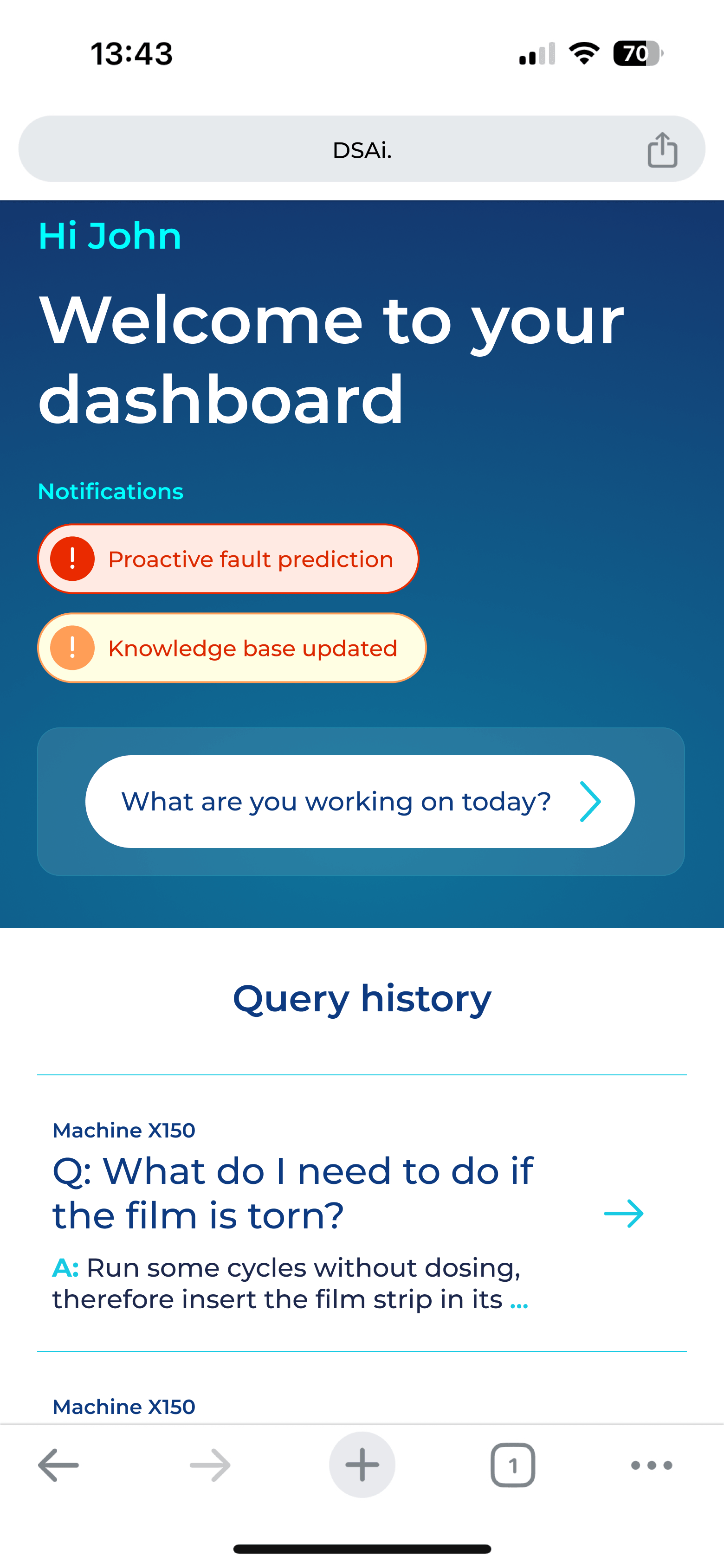
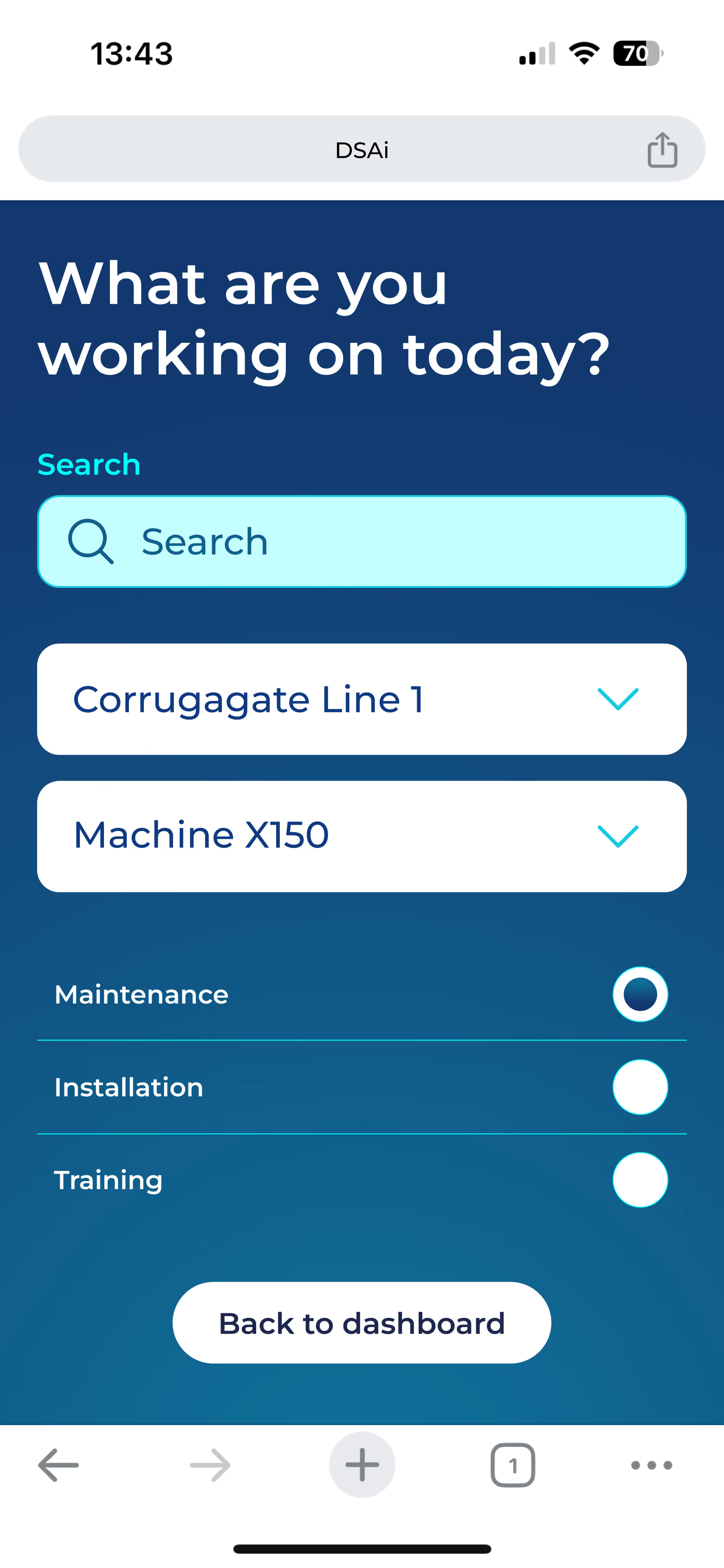
Dashboard

Engineers could immediately see recent activity, documentation and key actions from any device.

Mobile dashboard screen welcoming user John with notifications for proactive fault prediction and knowledge base update, a prompt asking what the user is working on today, and a query history showing a question about what to do if the film is torn with a partial answer.
Brand development

Query & Response

Mobile screen displaying a task selection interface with the prompt 'What are you working on today?' showing a search bar, dropdown menus for 'Corrugate Line 1' and 'Machine X150,' and radio buttons for Maintenance (selected), Installation, and Training, with a button labeled 'Back to dashboard' at the bottom.
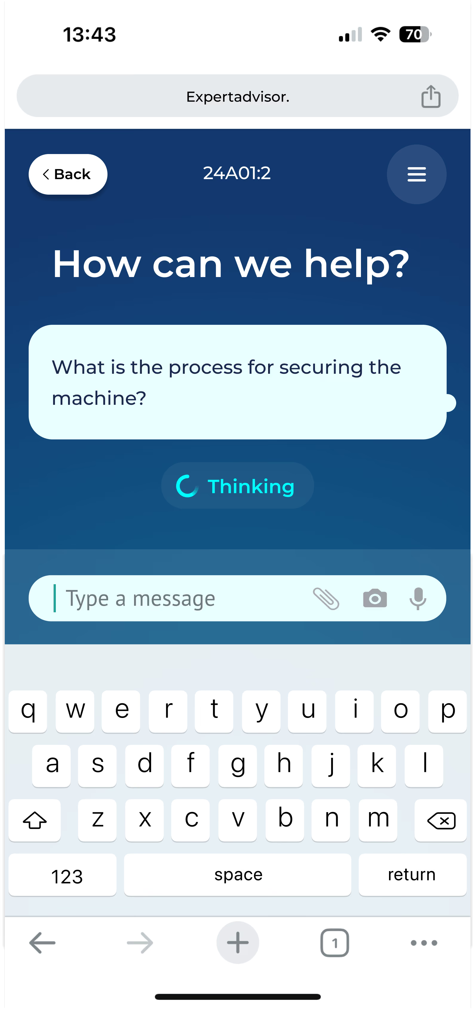
Mobile chat app screen showing a conversation under the title 'How can we help?' with a user message asking 'What is the process for securing the machine?' and a 'Thinking' status below, along with an on-screen keyboard and input field at the bottom.
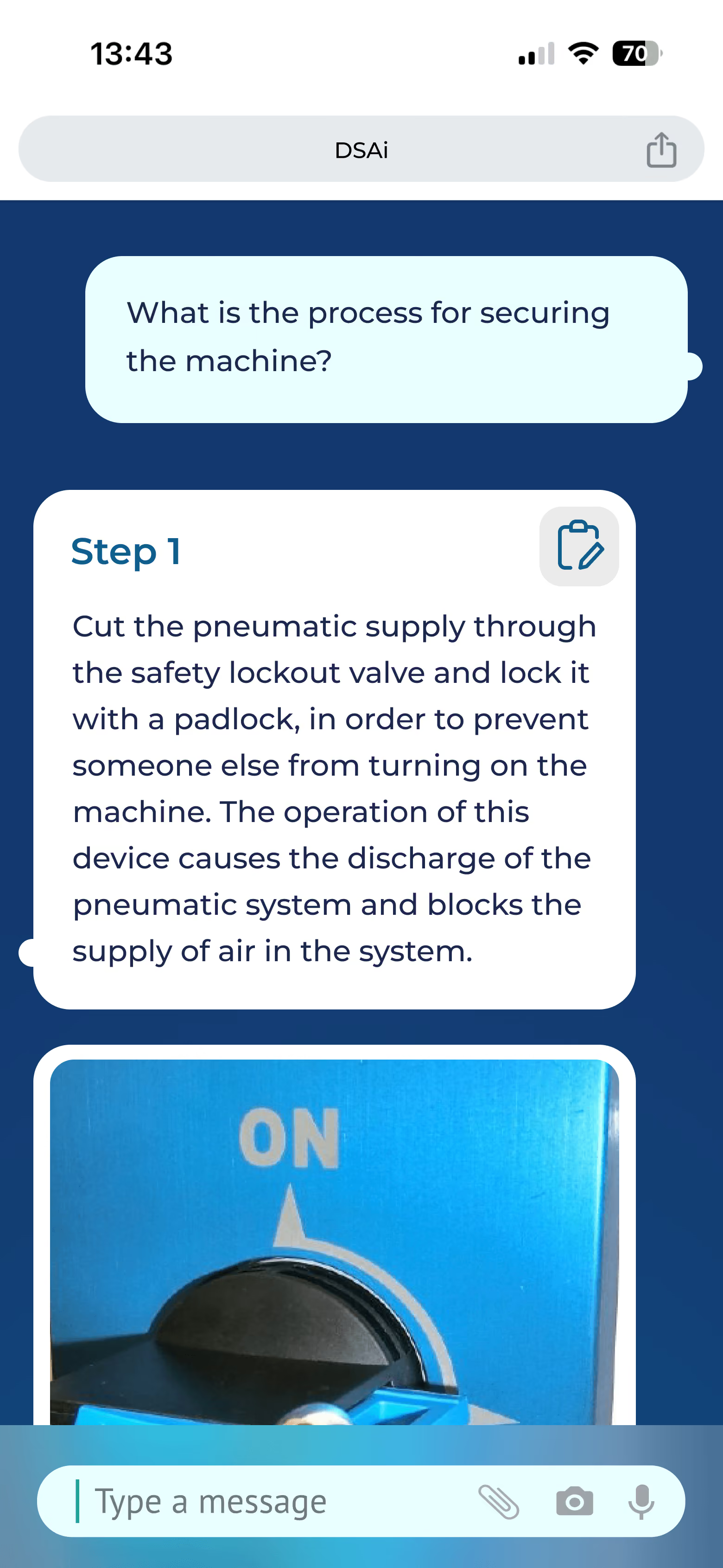
Screenshot of a mobile chat interface with a question asking about securing a machine. The response shows Step 1: cutting the pneumatic supply through the safety lockout valve and locking it with a padlock to prevent others from turning the machine on, causing discharge of the pneumatic system and blocking air supply. Below the text is an image of a close-up blue switch labeled 'ON' with a black knob and a padlock attached.

The conversational interface reduced the need to search through manuals, surfacing concise answers in seconds.

Document Management

User interface screen of a data source management system showing a list of uploaded documents with columns for customer, machine, description, type, and status, including buttons for managing system users, managing customers, help, and adding new documents.

Administrative tools supported the management of trusted documentation that powered every response.

Brand development

Built for the Factory Floor

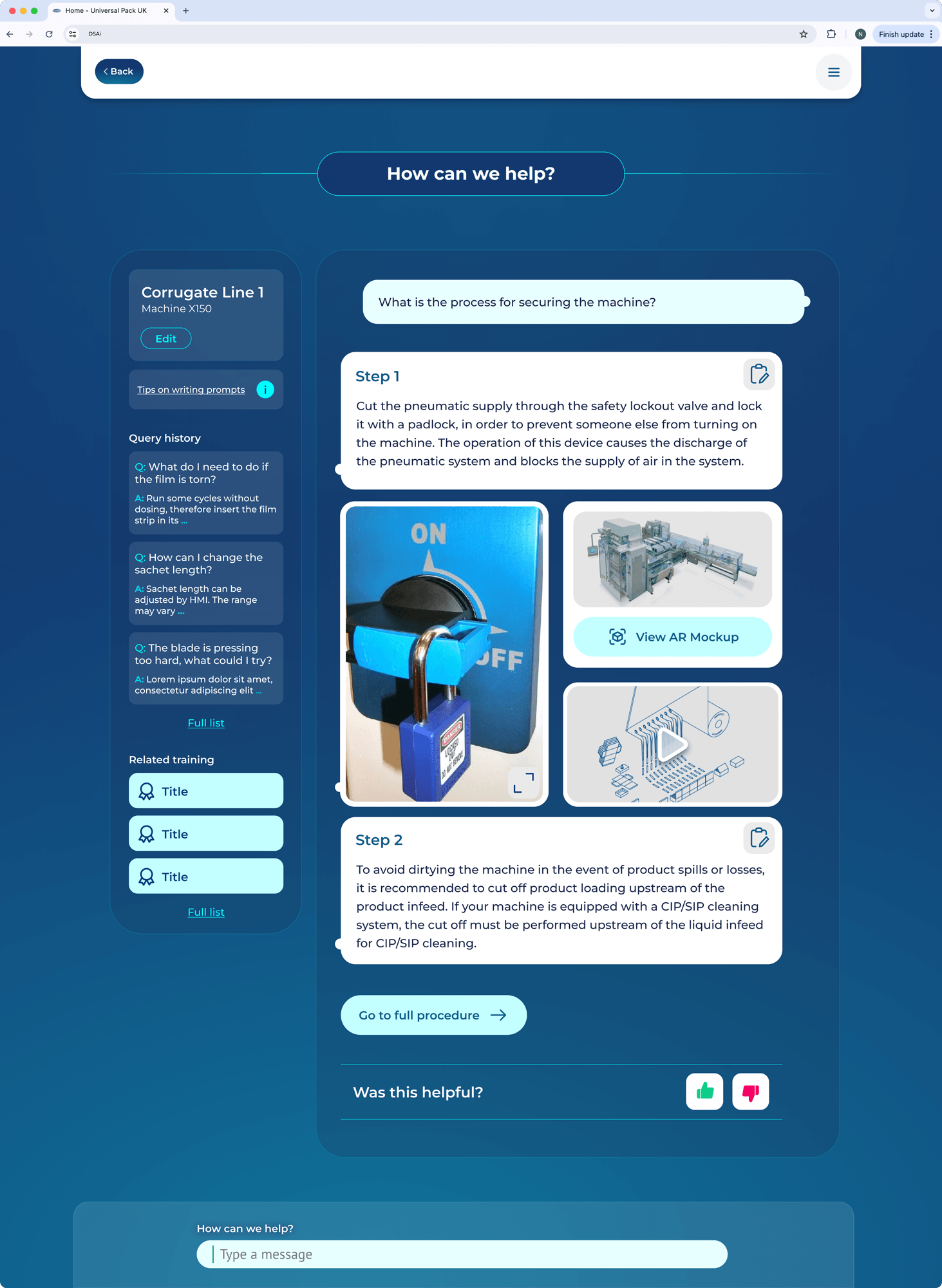
Responsive layouts were designed around the environments engineers actually worked in.

Tablet and mobile breakpoints were prioritised, allowing Expert Advisor to be used directly on the factory floor without sacrificing clarity or speed.

Digital interface screenshot showing a machine operation help desk for Corrugate Line 1, Machine X150. The main question asks about the process for securing the machine. Step 1 explains locking the pneumatic supply valve with a padlock to prevent unauthorized activation, accompanied by images of a locked valve switch, a machine AR mockup, and a schematic diagram. Step 2 advises cutting off product loading to avoid contamination during spills. There are options to edit, view related training titles, access a full list, and give feedback with thumbs up or down. A chat box and navigation controls are also visible.
Screenshot of a mobile chat interface with a question asking about securing a machine. The response shows Step 1: cutting the pneumatic supply through the safety lockout valve and locking it with a padlock to prevent others from turning the machine on, causing discharge of the pneumatic system and blocking air supply. Below the text is an image of a close-up blue switch labeled 'ON' with a black knob and a padlock attached.
Brand development

Validating The Idea

The proof of concept was tested in live manufacturing environments, where engineers relied on it during real maintenance and troubleshooting tasks.

Early results demonstrated that the approach wasn't just technically viable, it delivered measurable improvements to the way teams worked.

Beyond the numbers, the project revealed something equally important. Knowledge that had previously existed only in the experience of senior engineers was beginning to be captured, shared and reused across the wider organisation.

The proof of concept had validated the idea, opening the door for the concept to evolve.

20%

Reduction In Maintenance Time

15%

Reduction in Unplanned Downtime

The Opportunity

The proof of concept validated more than the technology, it validated the opportunity.

The success of the proof of concept revealed an opportunity far beyond a single organisation. To bring Expert Advisor to a wider market, Pelletech was established as a new venture dedicated to transforming the concept into a commercial platform for manufacturers.

This marked a significant shift in the project's priorities.

The product needed to grow beyond its original scope, supporting broader workflows while presenting a more confident, market-ready experience. What had proven itself as a practical engineering tool now needed to communicate innovation, reliability and trust before customers had even used it.

Brand development

A New Focus

As the product entered this new phase, my focus shifted towards defining a stronger visual language for the platform.

Working alongside a UX designer who expanded the underlying journeys, I concentrated on refining the interface, growing the component library into a scalable design system and ensuring the product felt both dependable for engineers and compelling to prospective customers.

Brand development

UI Exploration

Defining The Visual Language

The first release was designed to prove the idea. The next needed to sell it.

Early feedback showed the interface felt functional, but visually conservative, lacking the distinction needed to stand out in demonstrations.

The challenge became evolving the visual language without compromising the clarity and usability that had made the proof of concept successful.

Through a series of visual explorations, colour, typography, depth and interface styling were refined into a more confident identity that felt commercially credible while remaining practical for engineers.

Logo featuring a stylized letter 'P' in white and pink next to the words 'Pelle Tech' with 'Pelle' in white and 'Tech' in pink.Logo text with a lowercase white letter e followed by uppercase pink letter A and lowercase pink letter i.
Nine user interface icons arranged in a 3 by 3 grid, including a pink speech bubble with three dots, white eyeglasses, download arrow, clock with counter-clockwise arrow, clock face, pen, speaker with sound waves, circle with diagonal line, and play button in a rectangle.
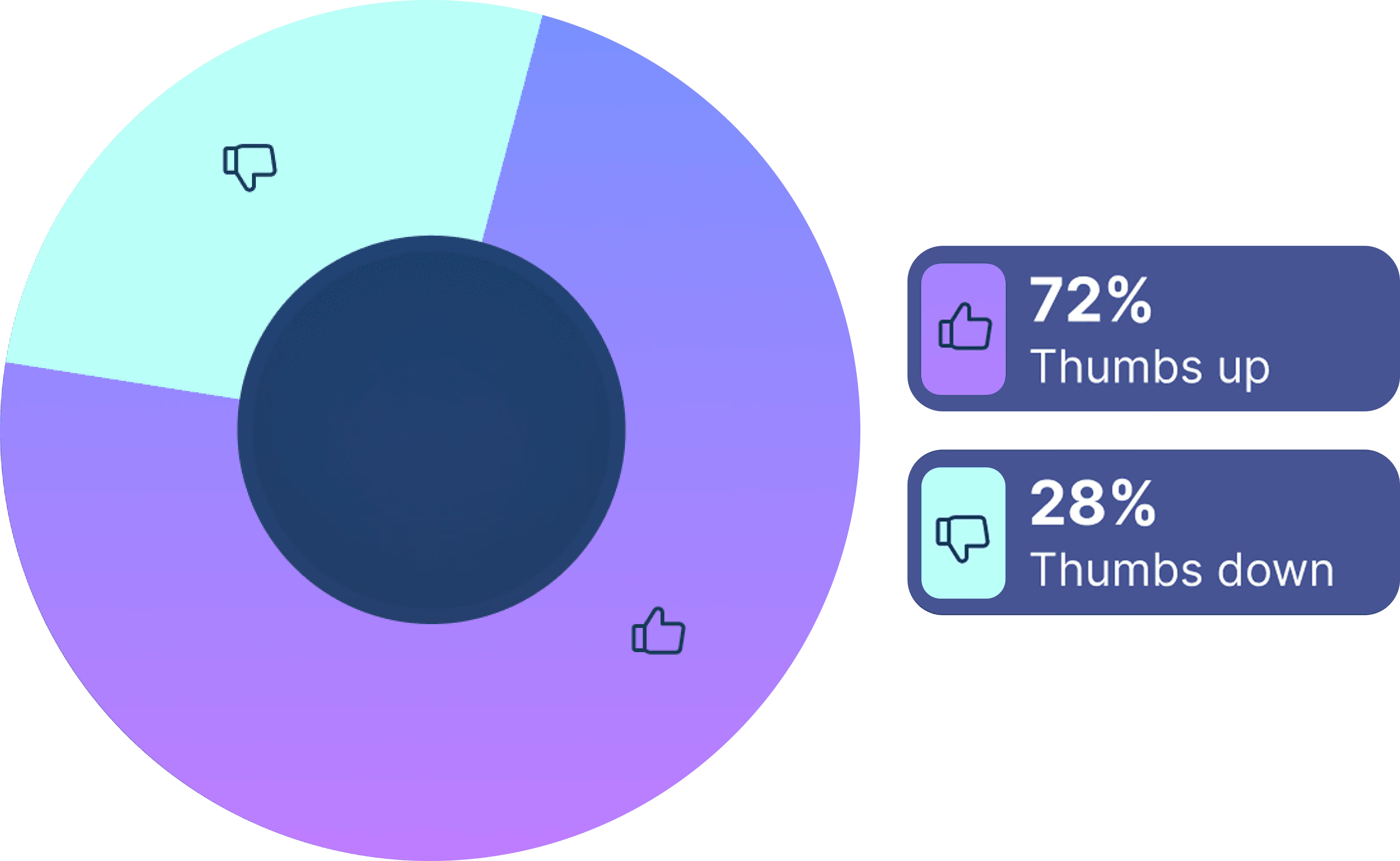
Donut chart showing 72% thumbs up in purple and 28% thumbs down in light blue, with matching labels on the right.
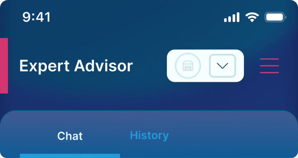
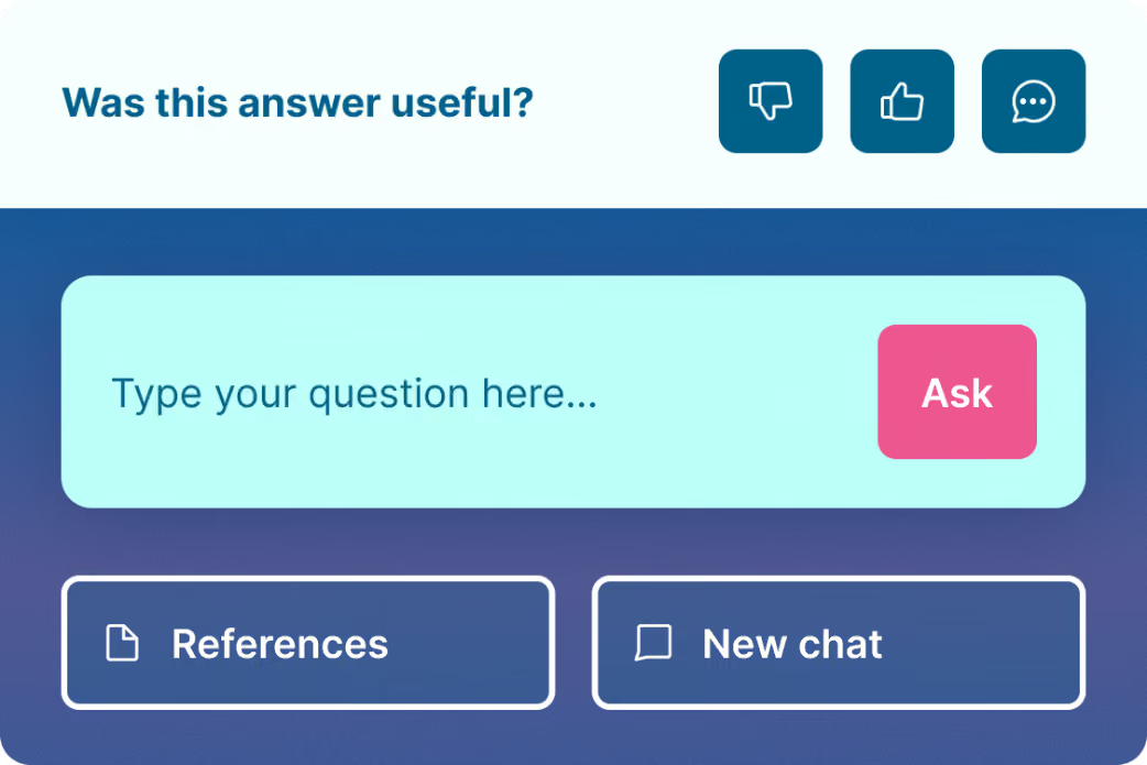
Mobile app interface header showing time 9:41, signal, Wi-Fi, and battery icons, with the title Expert Advisor and navigation tabs labeled Chat and History.User interface prompt asking 'Was this answer useful?' with icons for thumbs down, thumbs up, and chat. Below is a light blue input box labeled 'Type your question here...' with a pink 'Ask' button. Two buttons underneath labeled 'References' and 'New chat' are displayed side by side.
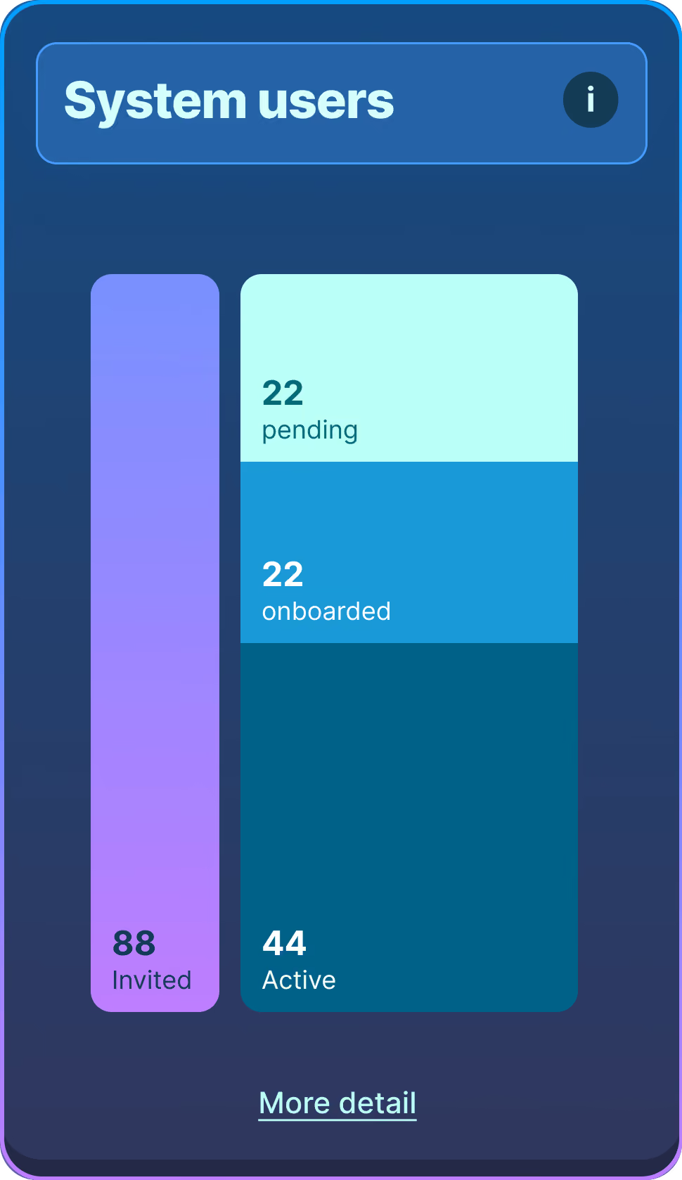
Dashboard section titled 'System users' showing user status: 88 invited, 22 pending, 22 onboarded, and 44 active with a 'More detail' link at the bottom.
Brand development
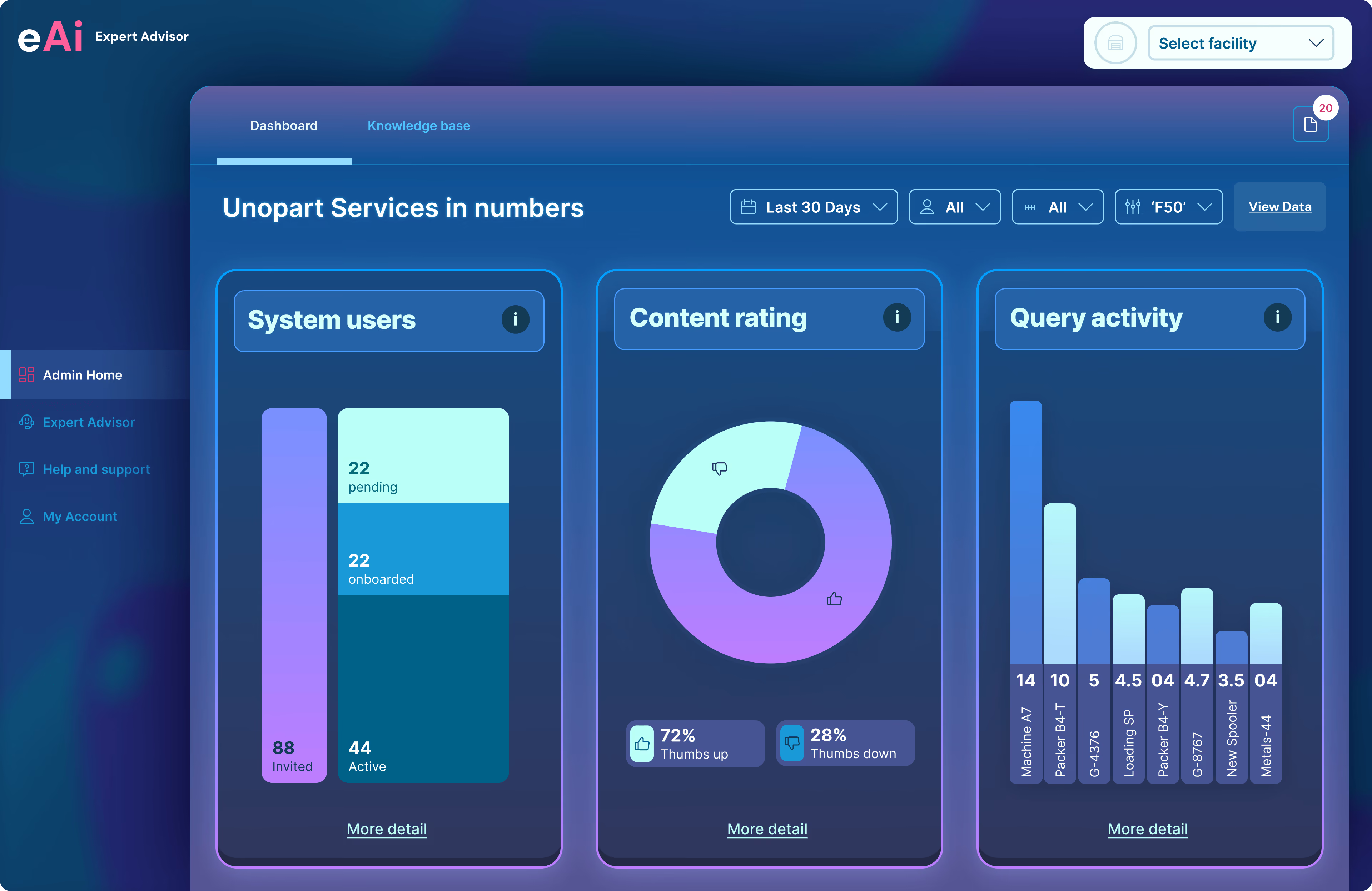
Dashboard screen of eAi Expert Advisor showing Unopart Services in numbers with three panels: System users panel displaying 88 invited users, 22 pending, 22 onboarded, and 44 active; Content rating donut chart showing 72% thumbs up and 28% thumbs down; Query activity bar chart listing queries with counts: Machino A7 (14), Packet B&T (10), G-4396 (5), Loadsmart SP (4.5), Packet Bay (4.7), Geo Swooper (3.5), and Meta54-44 (4). Side menu has Admin Home, Expert Advisor, Help and support, My Account options.

System Insights

Scaling beyond Chat

As the platform matured, visibility became just as important as retrieval.

Dashboard views gave administrators insight into adoption, content quality and query trends, helping organisations understand how knowledge was being used across their sites.

Brand development

Natural Language Search

Finding Answers Faster

Every interaction was shaped around the reality of the factory floor

Responses were intentionally concise, surfacing the most relevant information first while providing clear references that engineers could quickly verify before taking action.

Rather than adding complexity, the interface stayed focused on helping people solve problems with confidence and get back to work.

Brand development
Tablet screen showing an Expert Advisor chat interface branded with Unilever logo, featuring a prompt asking 'What are you working on today?' with a pink button labeled 'Tell us about your task.' Below is a text input area with placeholder text 'Type your question here...' and an 'Ask' button. Left side has navigation icons including a chat icon highlighted.
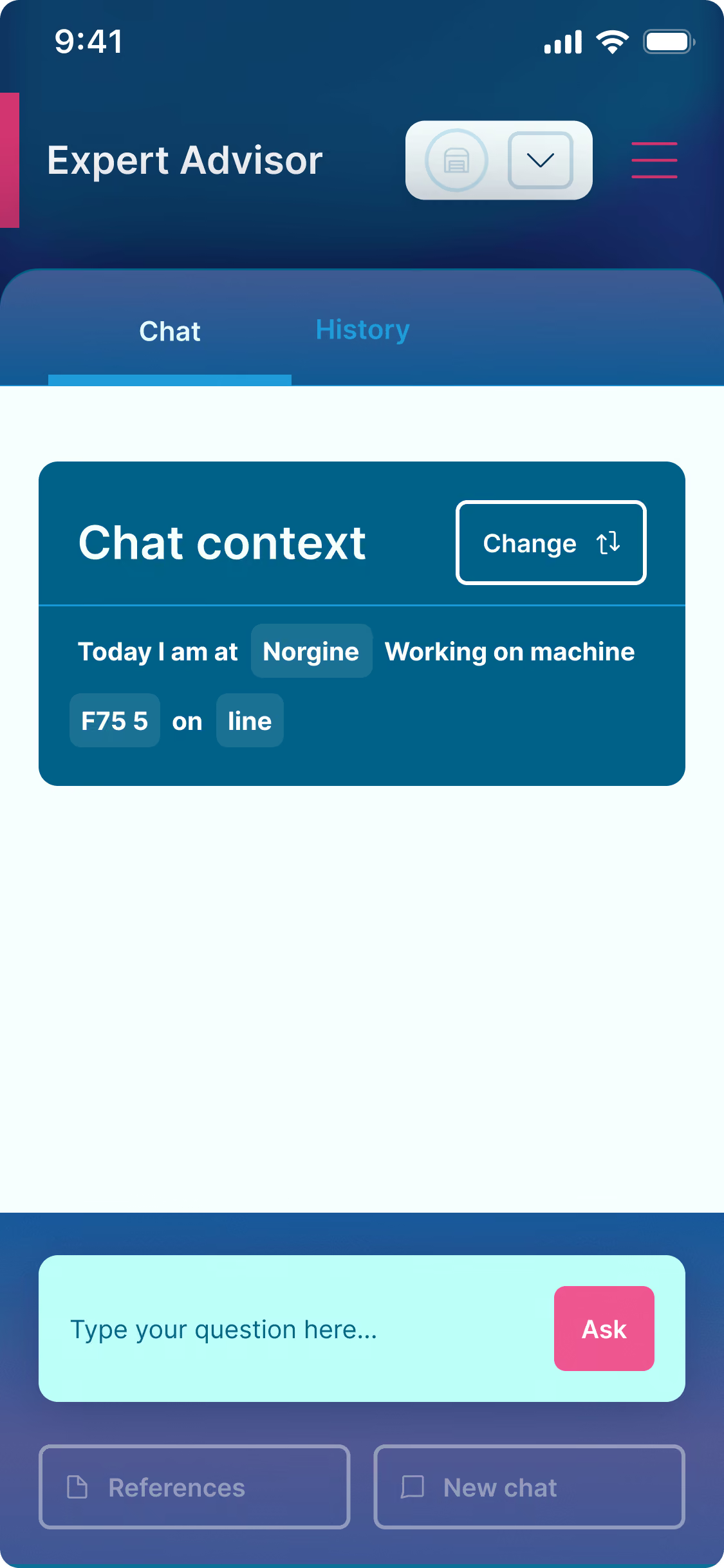
Mobile app screen with a header 'Expert Advisor' showing a chat interface. The active tab is 'Chat' with a 'Chat context' box containing the text 'Today I am at Norgine Working on machine F75 5 on line' and a 'Change' button. Below is a light blue input area with placeholder text 'Type your question here...' and a pink 'Ask' button. Navigation icons and a menu icon appear at the top.

Designing For Context

Built for Engineers On The Move

Designing for manufacturing meant designing for context, not just screens.

Rather than treating responsive layouts as a technical requirement, tablet and mobile became the primary experience, ensuring engineers could access trusted information naturally while working on the factory floor.

Brand development

Supporting The Launch

Introducing Expert Advisor To The World

As Expert Advisor moved towards commercial launch, the challenge extended beyond the application itself.

Prospective customers needed to understand the product before they ever used it.

Alongside the product UI, I designed and produced a launch film, a supporting marketing website and printed collateral for trade shows, ensuring every touchpoint reflected the same visual language and communicated the product's value with clarity and confidence.

The Opportunity

Reflection

What interested me most about this project was that it wasn't really about the technology, It was about making expertise accessible. We were never trying to replace experienced engineers, we were trying to ensure their knowledge could continue to help others.

The project reinforced something I value in my work, technology is at its best when it fades into the background, allowing people to focus on what they're actually trying to achieve.

Brand development
Logo featuring a stylized letter 'P' in white and pink next to the words 'Pelle Tech' with 'Pelle' in white and 'Tech' in pink.
Logo text with a lowercase white letter e followed by uppercase pink letter A and lowercase pink letter i.
Keep Exploring
Contact me...