



Metis site
Škoda logo

Positive Energy For Your Home

Reimagining a new energy brand from the ground up by translating strategy, branding and research into a cohesive digital experience.

Role:

Lead UI Designer

Team:

Brand | UI | UX | Product | Engineering

Client:

SMS plc

UX/UI

Design Systems

Brand Translation

Illustration

Responsive Design

Metis

My Contribution

My role was to ensure the evolving identity could become a coherent digital experience, As Lead UI Designer, my role was to translate an evolving brand into a cohesive digital product.

Working across UI, design systems, illustration and accessibility, I ensured every touchpoint expressed the same visual language while collaborating closely with Brand, UX and Engineering.

Throughout the project my role evolved alongside the brand itself, helping shape how strategy became a product experience.

The Opportunity

From Web Build To Product Transformation

Initially, CI&T were invited to design and build a responsive website for the launch of Metis, a new consumer-facing renewable energy brand created by SMS plc.

However, conversations with stakeholders quickly uncovered a much bigger opportunity.

The existing brand direction felt safe, but lacked the personality and distinctiveness needed to stand apart in an increasingly competitive market. Rather than simply designing pages, we began rethinking how the entire brand could be experienced digitally.

Our role shifted from delivering a website to defining a new brand that would help people understand, trust and engage with Metis for the first time.

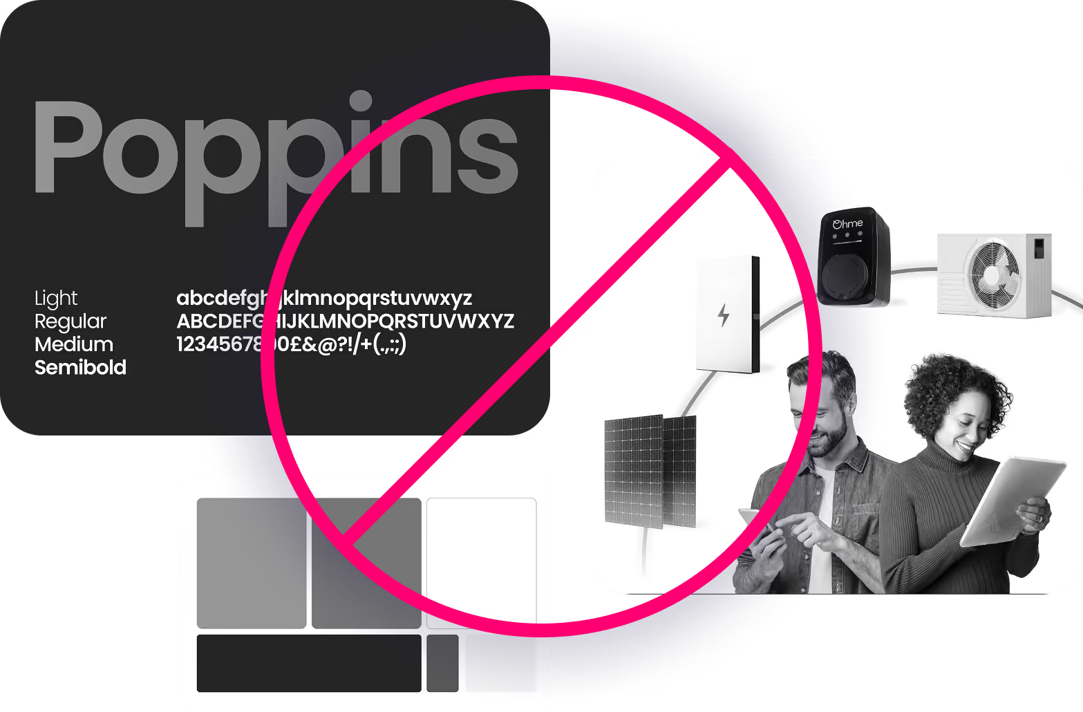
Typography sample for the Poppins font family displaying light, regular, medium, and semibold weights with corresponding alphabet and special characters in white text; next to it is a photo of a man and woman using smart devices with solar panels and electrical equipment, all crossed out by a large pink prohibition symbol.
White multiplication or close symbol inside a solid red circle.

Build a responsive B2C website to support the launch of the Metis brand.

White checkmark inside a solid green circle.

Reimagine the existing brand and digital experience making clean energy simple, reliable, and appealing

The Brief

Renewable Energy Had An Image Problem.

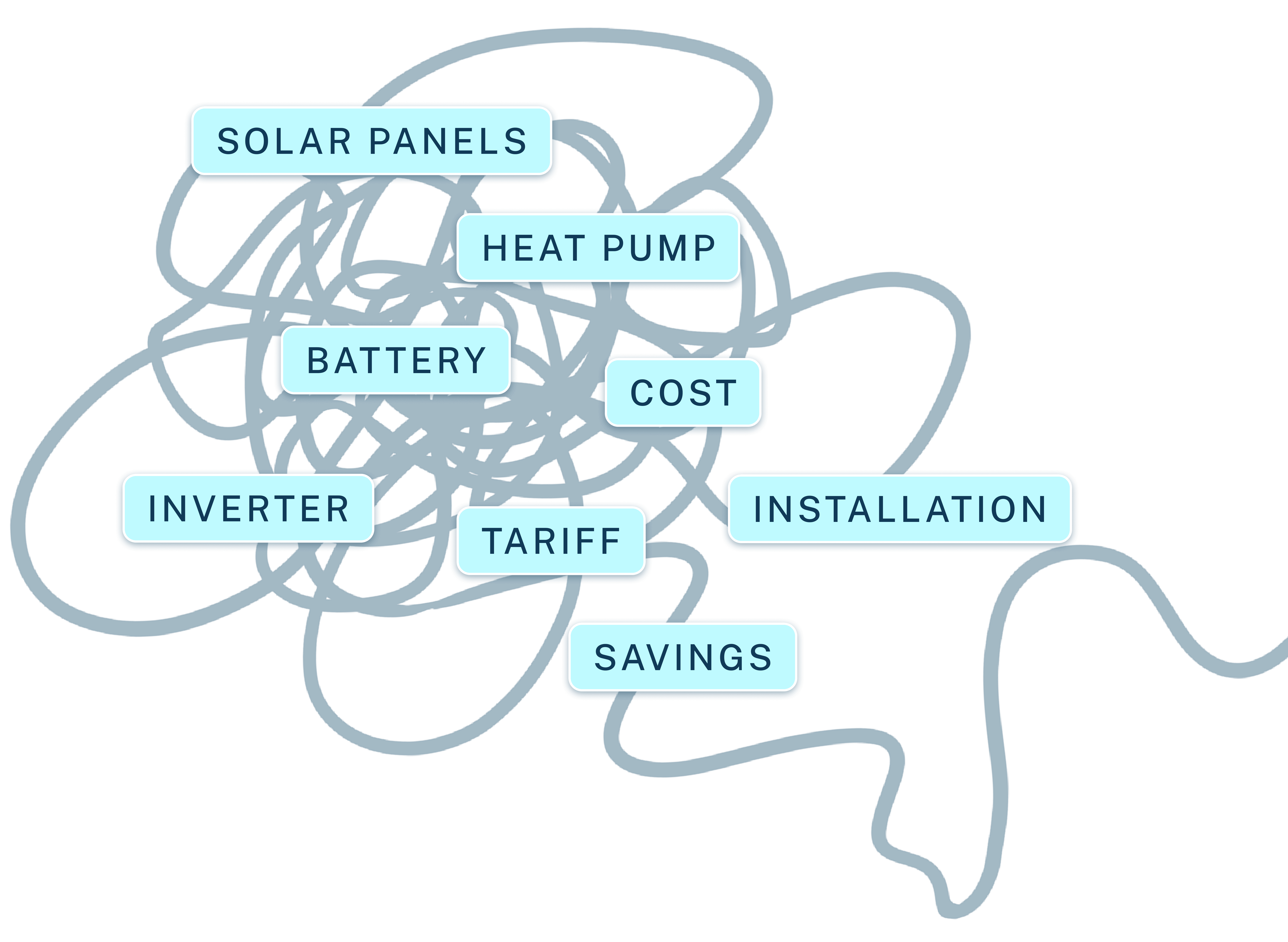
Research showed that affordability wasn't the biggest barrier. Understanding was. People found renewable energy

Confusing. Technical. Overwhelming.

Even when solutions were financially accessible, users struggled to understand costs, installation and long-term value.

The challenge wasn't simply communicating information. It was making renewable energy feel approachable.

Tangled thick dark blue line with labeled nodes related to renewable energy components and factors, including solar panels, heat pump, battery, inverter, cost, tariff, installation, and savings.
Research

What we discovered

Through a combination of qualitative interviews and market research, we explored how people understood renewable energy, where uncertainty existed, and what prevented them from taking the next step.

Those insights became the foundation for the experience that followed.

Stylized icon of binoculars with two round lenses and a connecting bridge in dark blue.

Clarity

Users struggled to fully understand pricing, installation requirements and confusing technical terminology.

Clipboard icon with a checkmark symbol, indicating a completed task or approval.

Confidence

The category felt distant and overly technical, creating hesitation even when the proposition was attractive.

Research

Defining the experience

Research suggested the experience needed to balance two complementary qualities.
On one side, users needed reassurance that Metis was trustworthy, transparent and knowledgeable.

On the other, the brand needed enough warmth and optimism to inspire confidence in a cleaner future.

Those two principles became the foundation for every design decision that followed.

Reassurance

Inspiration

Exploration
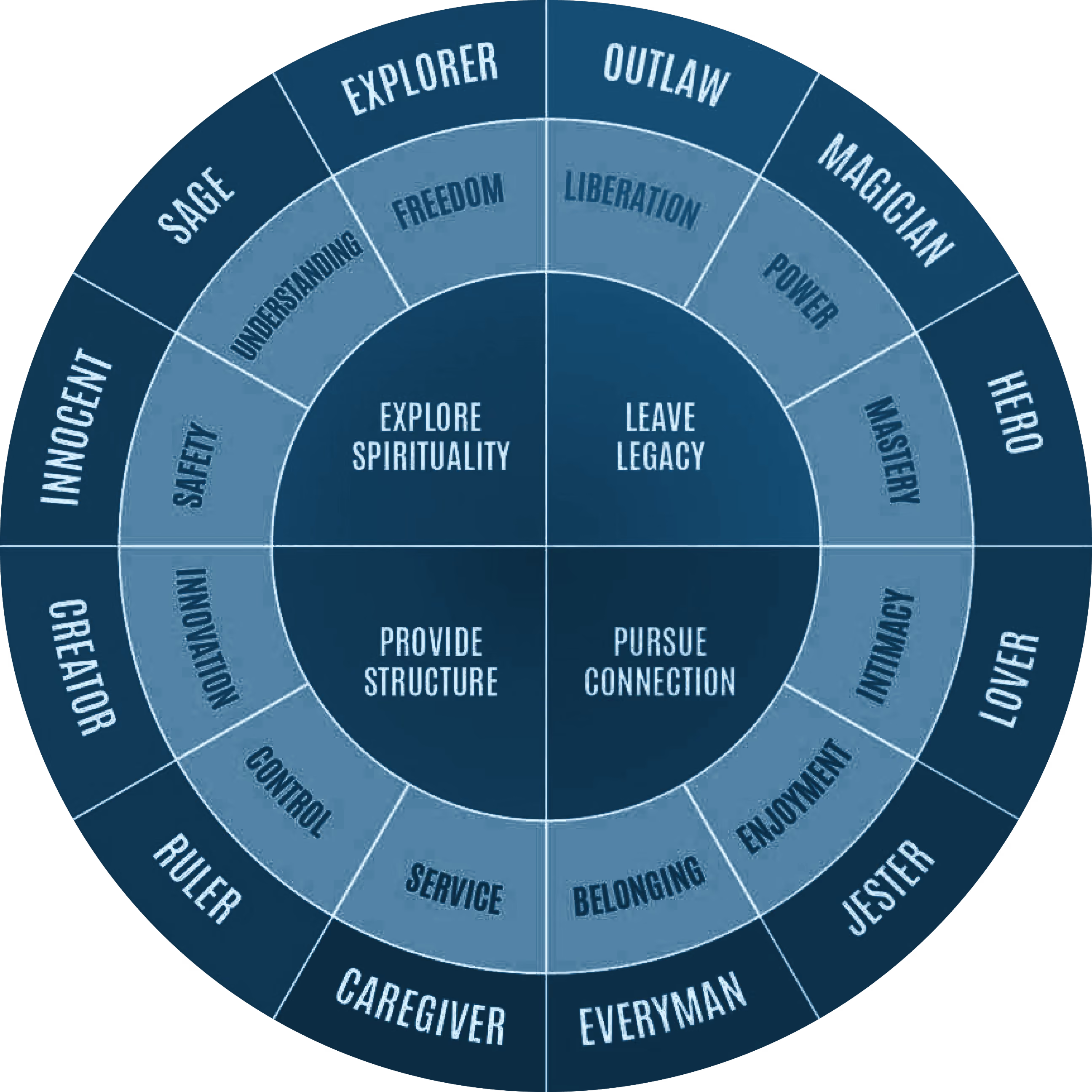
A circular archetype chart divided into four quadrants labeled Explore Spirituality, Leave Legacy, Provide Structure, and Pursue Connection. Twelve archetypes are arranged around the circle: Sage, Explorer, Outlaw, Magician, Hero, Lover, Jester, Everyman, Caregiver, Ruler, Creator, and Innocent. Each archetype has associated values such as Understanding, Freedom, Liberation, Power, Mastery, Intimacy, Enjoyment, Belonging, Service, Control, Innovation, and Safety.

Translating strategy into identity

Before exploring visual execution, we needed a shared understanding of who Metis Were.

Working closely with the client through collaborative workshops, we used brand archetypes to explore the different personalities the brand could adopt.

Rather than beginning with colours or typography, we aligned on character first, ensuring every touchpoint expressed the same personality.

Together, we narrowed these down to three distinct directions: The Sage, The Hero and The Magician before using them as a framework to guide the evolving visual identity.

Exploration

With three brand archetypes identified, the next step was exploring how each could be expressed visually.

We developed three distinct creative routes, each interpreting a different personality through colour, typography, composition and illustration.

Presenting these directions back to the client allowed us to evaluate not only how Metis looked, but how each route felt.

Together, we refined the strongest ideas into a single visual direction, ultimately embracing the qualities of 'The Sage' as the foundation for the evolving brand.

'THE SAGE'

Calm

Knowledgeable

Reassuring

'THE HERO'

Bold

Confident

Action Oriented

'THE MAGICIAN'

Innovative

Optimistic

Transformative

Brand development
Metis company logo with a stylized hexagonal swirl symbol followed by the word 'metis' in lowercase bold letters.

Over time 'The Sage' route became more defined, This allowed for the other two routes to be retired.

Brand development

The Final Identity

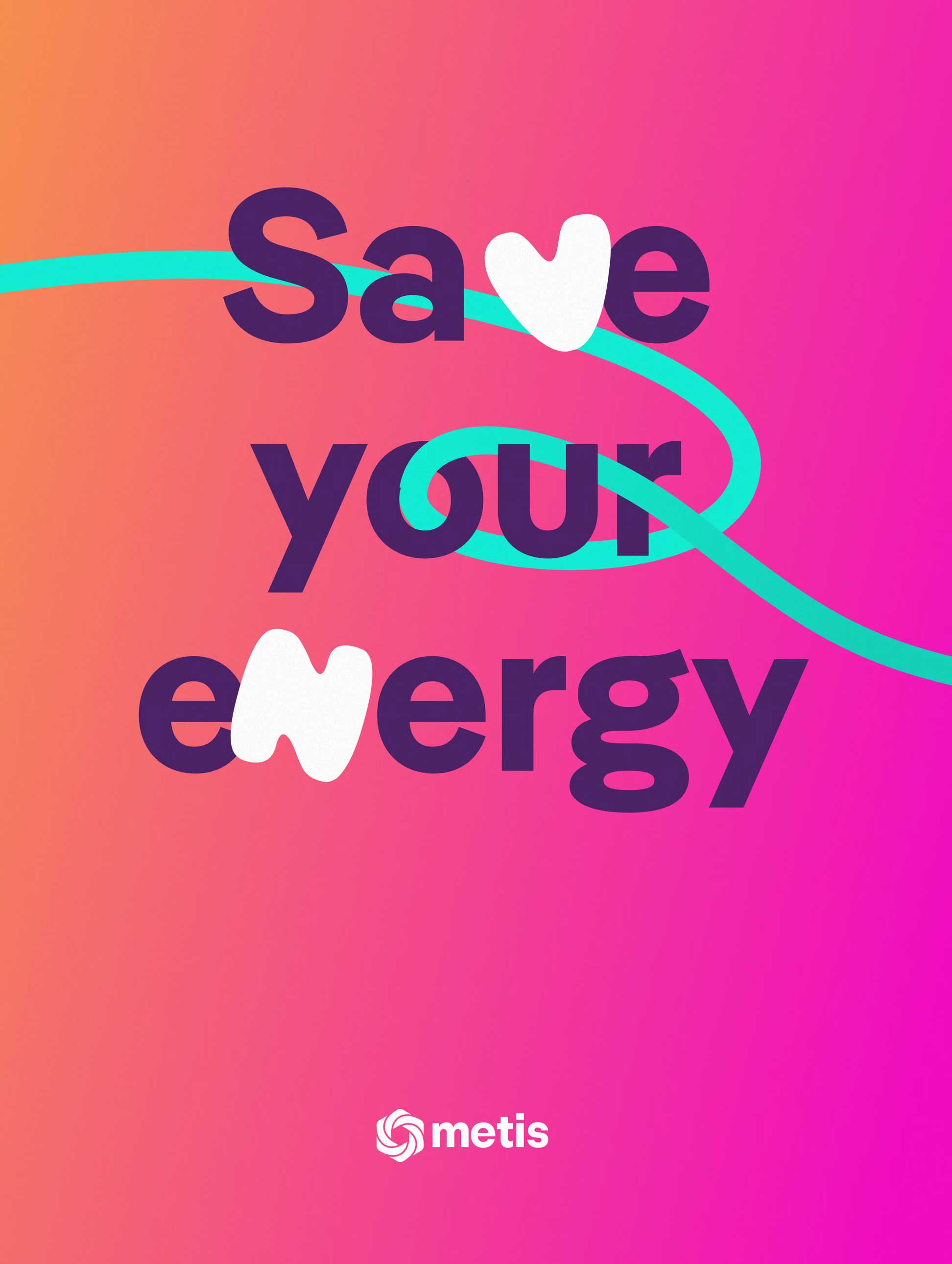
The chosen direction balanced warmth with clarity, helping renewable energy feel approachable without losing credibility. A bold colour palette and vibrant gradients introduced optimism and energy, while the Blimp typeface brought a more welcoming, conversational tone.

A flowing graphic device, supported by curated imagery, became a visual thread throughout the experience, symbolising the connections between people, their homes and the wider energy ecosystem.plored breaking the process into a series of smaller, more manageable steps, grouping related questions together.


Brand development

Illustration

The Content Problem

We ran into an issue with content this was a new offering to the market, therefore we had no photography to work with.

Stock imagery was too generic and we were unable to rely on AI generated imagery as the image inconsistencies were noticible and didnt come across as trustworthy. we needed a different approach

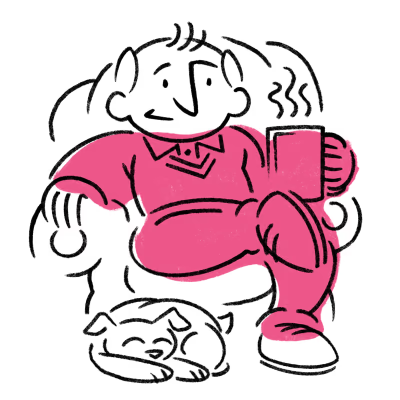
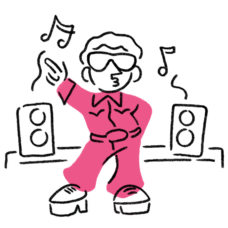
Therefore working closely with the wider team, I developed a bespoke illustration style that balanced clarity with personality, reinforcing the wider brand rather than competing with it.
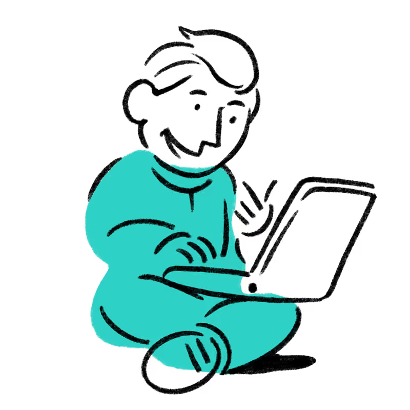
Cartoon character sitting cross-legged using a laptop, wearing a teal outfit and smiling.
Simple line drawing of a person reclining in a chair holding a steaming mug, wearing a pink outfit, with a small dog curled up sleeping at their feet.
Cartoon of a person wearing sunglasses and a pink disco outfit with platform shoes dancing between two speakers, with musical notes around.
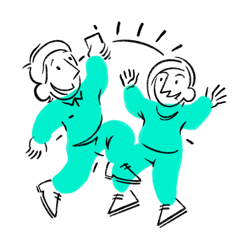
Illustration of two people in teal outfits joyfully jumping and giving each other a high five with smiles.
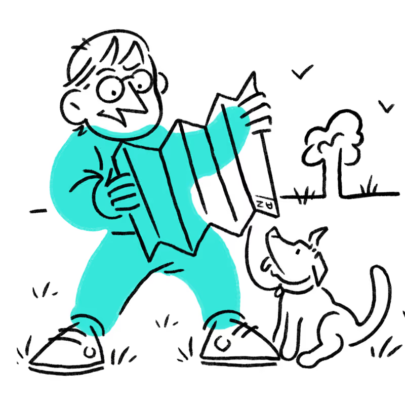
Illustration of a person wearing a teal outfit holding an unfolded map, standing on grass, looking at a happy dog sitting nearby, with a tree and birds in the background.
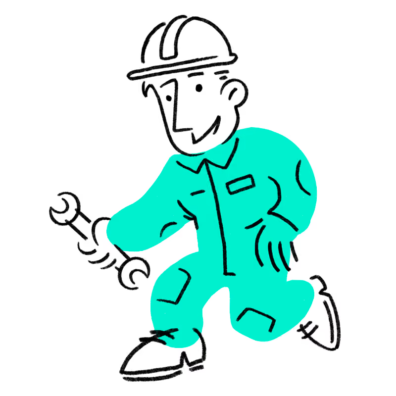
Cartoon-style drawing of a smiling engineer or mechanic wearing a hard hat and teal coveralls, holding a wrench in one hand while walking.
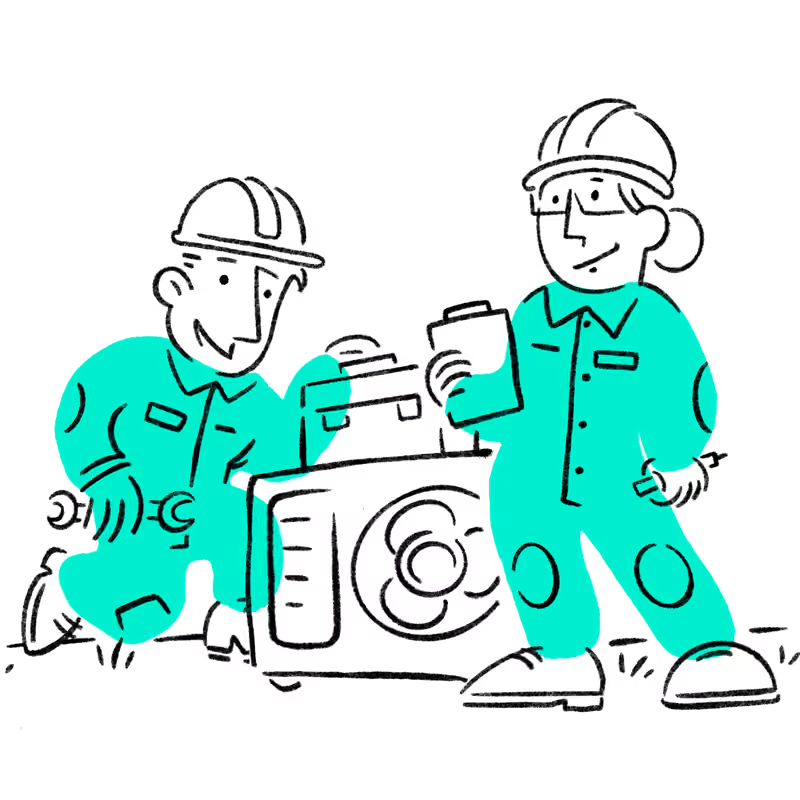
Illustration of two engineers in teal uniforms and safety helmets working on a machine with a visible fan; one kneels holding a wrench, the other stands holding a clipboard and tool.
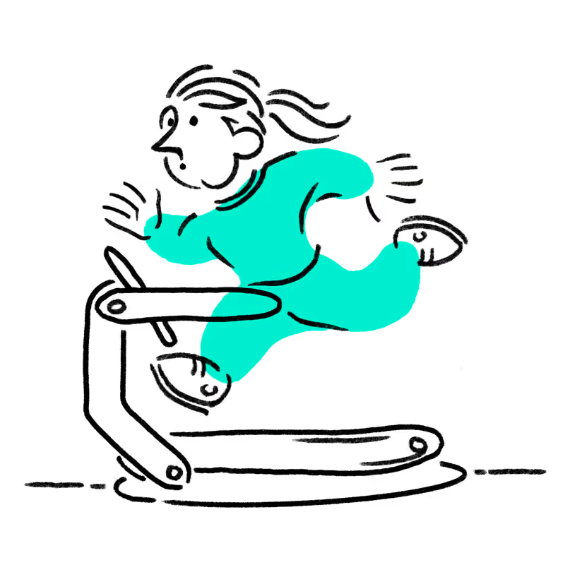
Illustration of a person in a teal outfit running on a treadmill with one foot raised, hair flowing back.
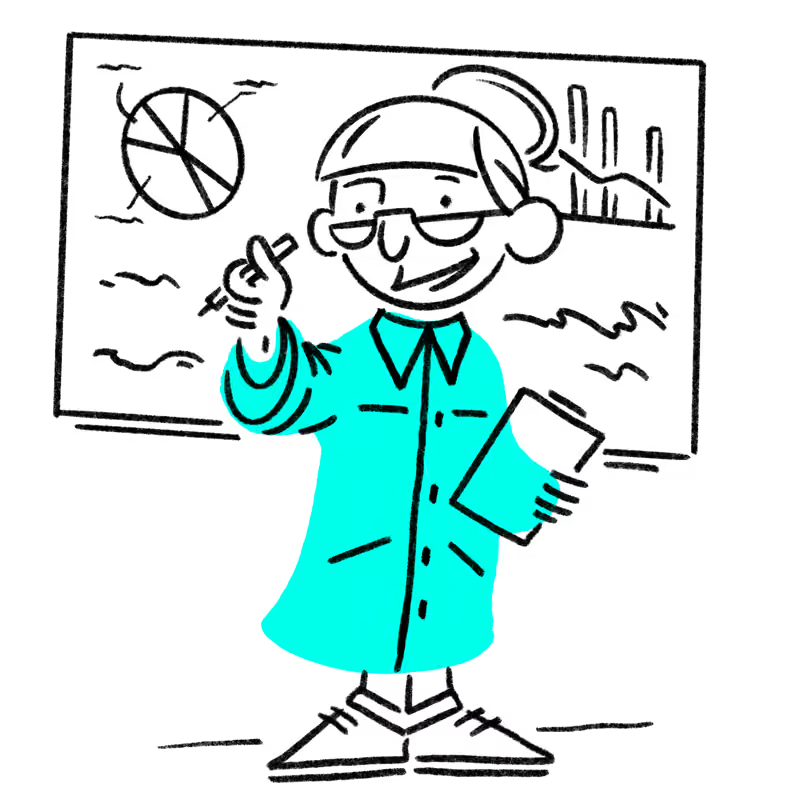
Cartoon of a person wearing glasses and a blue shirt presenting data on a whiteboard, which includes a pie chart and a descending bar graph.
Brand development

Illustration

Finding a visual language

The illustrations weren't created simply to stand in for photography, they acted as a focal point to make the interface more engaging. They became a storytelling tool.

Therefore working closely with the wider team, I developed a bespoke illustration style that balanced clarity with personality, reinforcing the wider brand rather than competing with it.
The result wasn't simply a library of illustrations, but a scalable visual language that made complex energy products feel more approachable and recognisably Metis.

Product Development
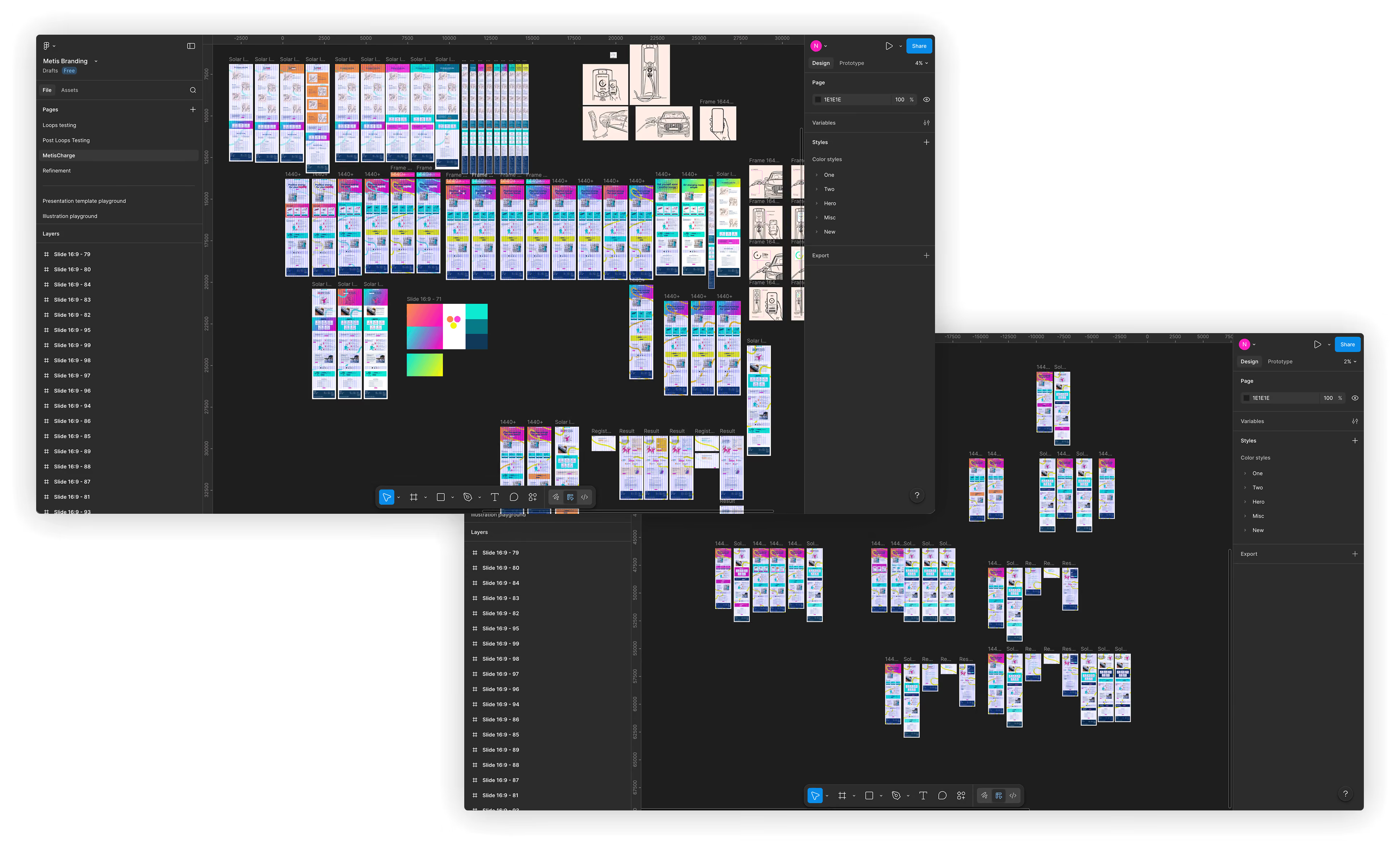
Two overlapping screenshots of a UI design tool interface showing multiple mobile app screen wireframes organized in rows and columns with layers and design settings panels visible on the sides.

UX/UI

Shaping the Experience

With the foundations of the brand beginning to take shape, the next challenge was understanding how it would behave as a digital product.

Rather than simply applying the emerging identity to interface designs, the UI became a space for exploration. We deliberately pushed the visual language, testing where it felt confident, where it became overwhelming, and where it struck the right balance.

Those explorations helped define not only how Metis looked, but how it felt to use.

The Turning Point

By this stage, the personality of the brand was beginning to feel established. The challenge shifted from exploring possibilities to applying those ideas consistently across a growing digital product.

Only once that balance had been found did it make sense to stop exploring and begin building a scalable product.

Product Development
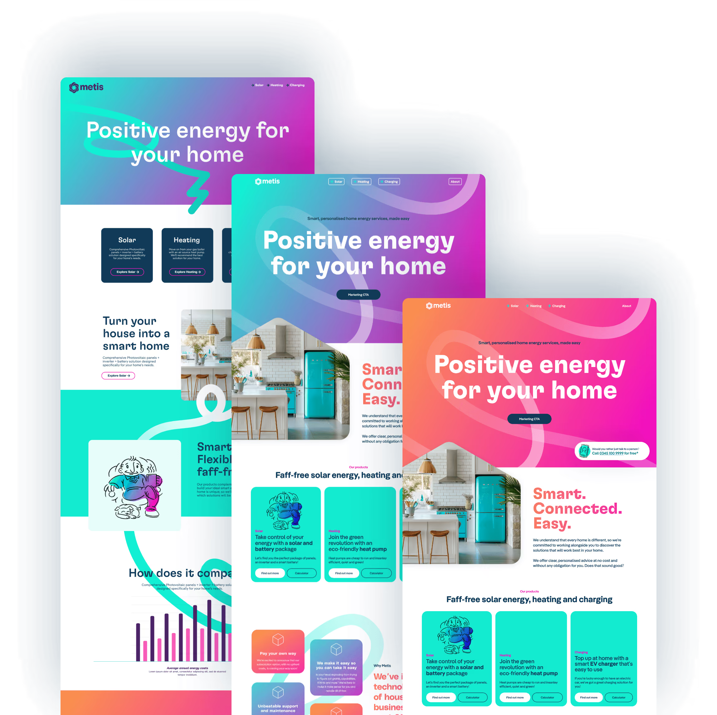
Three overlapping brightly colored website interface mockups for Metis showing the headline 'Positive energy for your home' with sections about solar, heating, charging, smart connected home energy, and illustrations including a blue cartoon character and a modern kitchen image.

UX/UI

Evolving a brand into a product

Rather than treating the UI as a layer applied at the end, every element of the interface became an extension of the brand itself.

Once the strategic direction had been established, focus shifted to translating the identity into a coherent digital experience.

Those explorations helped define not only how Metis looked, but how it felt to use.

Product Development

UX/UI

Bringing the experience to life

The interface evolved through rapid iteration, exploring different approaches before refining them into a consistent system that worked across every touchpoint.

Working closely with UX and development, each screen balanced clarity, accessibility and personality while remaining faithful to the wider brand.

Product Development

Design Systems

From Exploration to System

We deliberately prioritised exploration over rigid structure in the early stages of the project. As the visual language matured, patterns began to emerge across typography, layouts, illustration and interaction.

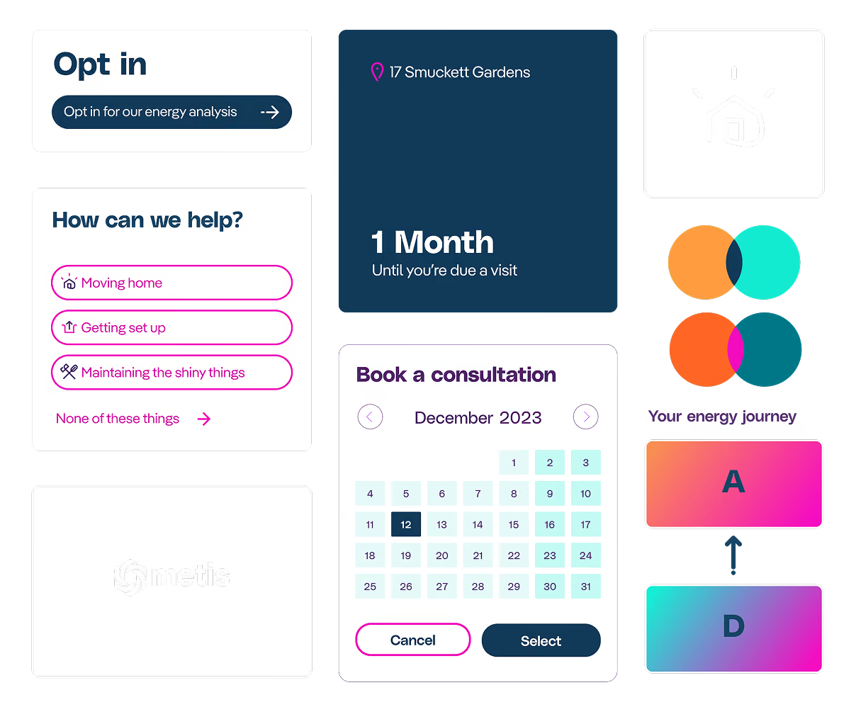
The design system wasn't the starting point, it became the framework that captured these decisions, allowing the product to scale while preserving the personality we'd worked hard to establish.

User interface elements showing energy service options: 'Opt in for our energy analysis' button, help topics with pink icons including Moving home, Getting set up, Maintaining the shiny things, and None of these things link, a dark box with '1 Month Until you're due a visit' at 17 Smuckett Gardens, booking calendar for December 2023 with selectable dates and Cancel and Select buttons, an illuminated house icon in a square, overlapping orange and turquoise circles labeled 'Your energy journey', and gradient buttons labeled A above D with an arrow between them, plus a grey box with a white Metis logo.
Metis
Reflection

Reflection

Metis reinforced something I've found throughout my career. The most rewarding part of design isn't refining interfaces, it's helping ideas discover their identity before translating them into products people can trust. Working across branding, UI and illustration allowed every discipline to strengthen the others rather than exist in isolation.

Keep Exploring
Contact me...