E.ON NEXT LAUNCH SITE
Škoda logo

A New Era For E.ON

Helping turn a new energy brand into a digital product ready to serve millions of customers in just 14 weeks
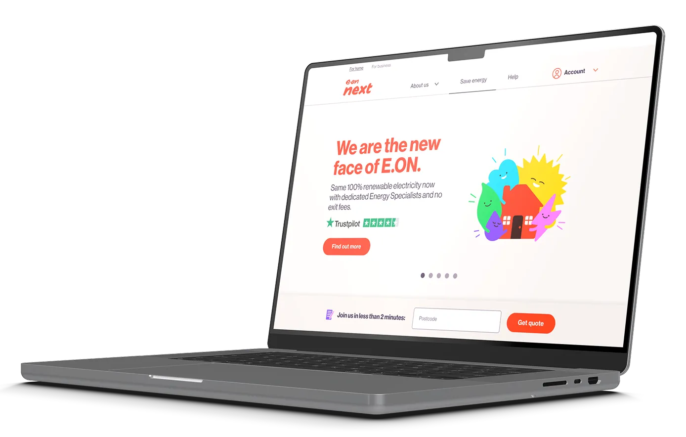
Laptop screen showing E.ON Next website homepage with the text 'We are the new face of E.ON' and options for finding quotes with postcode input.

Role:

UI Design

Team:

UI | UX | Product/Delivery | Engineering

Agency

Somo

Green leaf character with a smiling face holding a blue smartphone or device with one hand, standing on a brown surface.
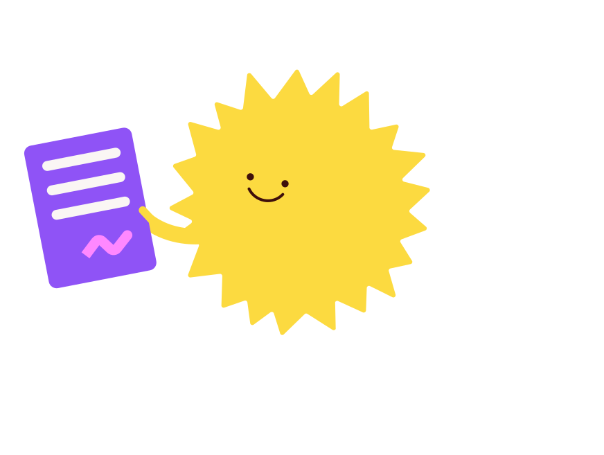
Smiling sun character holding a purple document with white lines and a pink signature with two gray clouds.
E.ON NEXT LAUNCH SITE

The Clock Was Ticking

E.ON Next was a new digital-first energy brand, being built on an existing platform and prepared for launch at speed.


I joined the project through Somo as Lead UI Designer, working alongside another senior UI designer and a wider UX, product, engineering and delivery team.


With 14 weeks to get it over the line, we had a lot of work ahead of us.
Smiling pink lightning bolt character with eyes and mouth, holding a purple meter gauge showing a needle pointing right, with curved lines above indicating wireless signal.
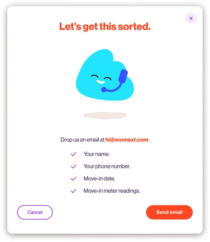
Customer support form with heading 'Let's get this sorted,' featuring a happy blue cloud character wearing a headset. The form asks to email hi@eonnext.com with your name, phone number, move-in date, and move-in meter readings. Two buttons labeled Cancel and Send email are at the bottom.
E.ON NEXT LAUNCH SITE

Order in the chaos

There wasn't time for a perfectly linear design process.

We were working with existing Kraken functionality, UX and UI were often moving in parallel and Jira tickets were coming through thick and fast.


With two UI designers covering a lot of ground, we divided up the work equally, shared ideas and picked things up from each other whenever we needed to. The priority was keeping everything moving in the same direction.

Constant communication kept us on track.
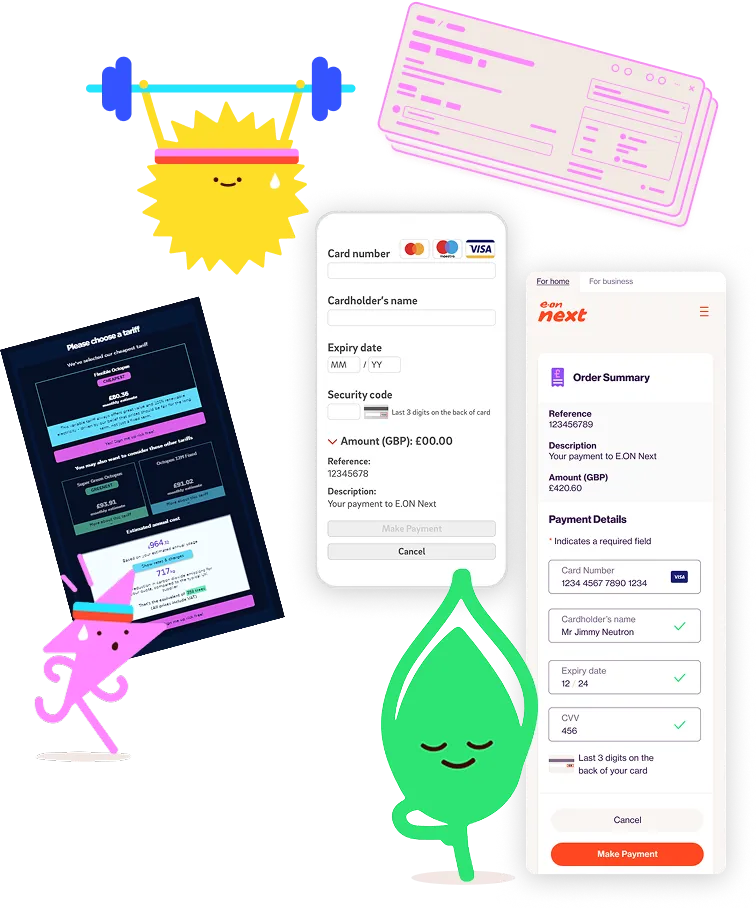
Illustration showing two happy cartoon characters exercising: a yellow spiky sun lifting a blue barbell with sweat, and a green drop-shaped figure meditating. There are also three smartphone screens showing payment-related interfaces, including form fields for card number, cardholder name, expiry date, CVV, order summary, and buttons for making or canceling payments.
E.ON NEXT LAUNCH SITE

Turning the brand into a working product

E.ON Next already had a polished new visual identity. Our job was to work out how that translated into a tangible digital experience.

We took the character, colour and energy of the brand and translated it into a responsive interface that could work across desktop, tablet and mobile.
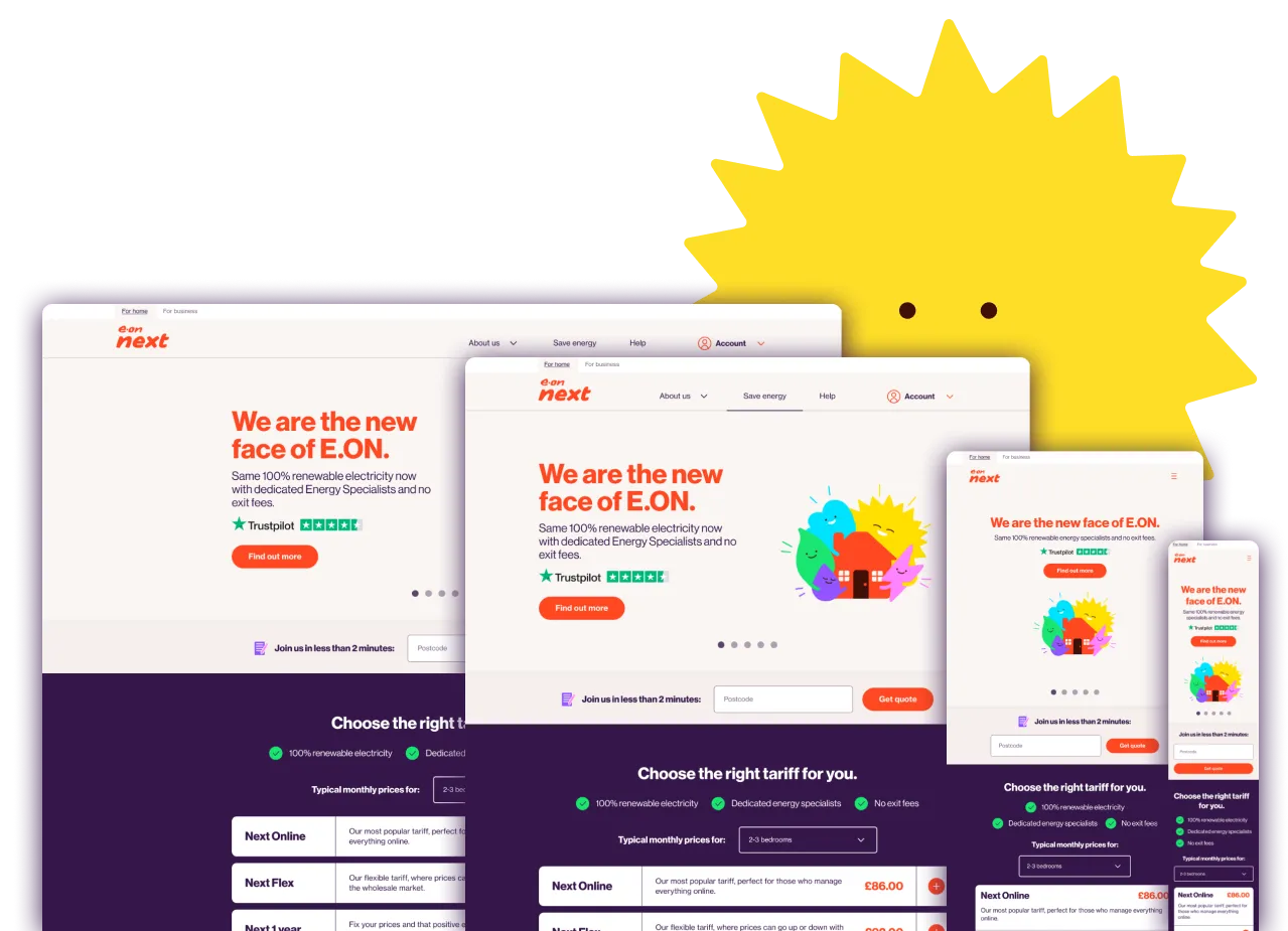
Website homepage mockups for E.ON next displayed in desktop, tablet, and mobile views, showing headline 'We are the new face of E.ON.' with text about 100% renewable electricity and dedicated energy specialists, accompanied by colorful cheerful sun and cloud illustrations.
E.ON NEXT LAUNCH SITE

This wasn’t a single neat journey

Across the span of the project we worked through a huge number of interconnected customer flows, from Profile and account management to Listings, Vehicle profiles & fuel finder
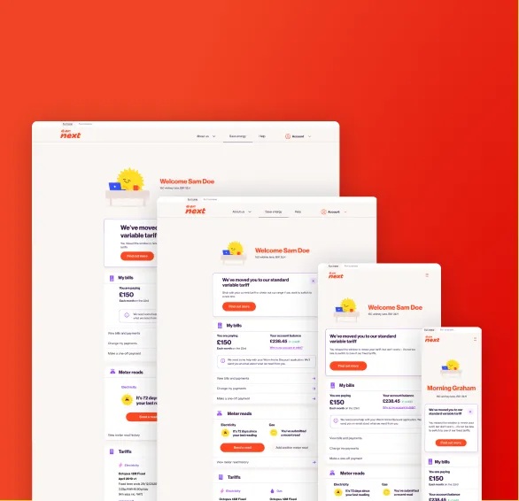
Four digital devices—a laptop, desktop monitor, tablet, and smartphone—display a utility service interface with a welcoming message to Sam Doe or Morning Graham, showing billing information, meter reads, and tariff details on a clean white background against a bright red backdrop.
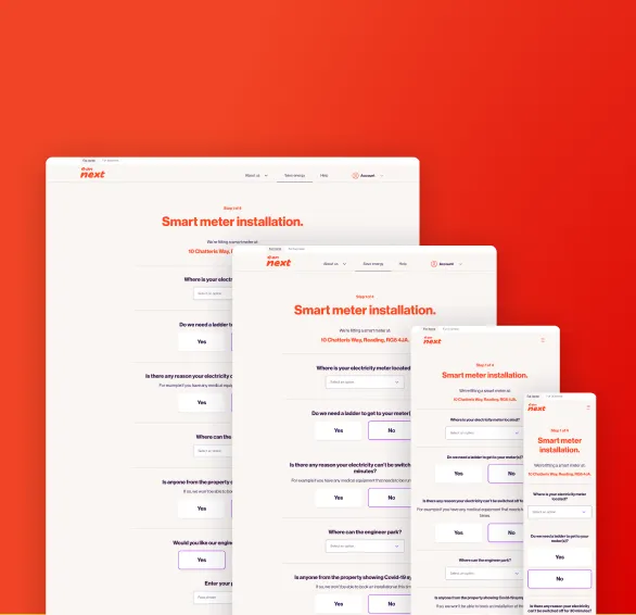
Four overlapping screenshots of a smart meter installation webpage displayed on different devices, showing the same form with questions about electricity meter location, need for a ladder, and property access, against a red gradient background.
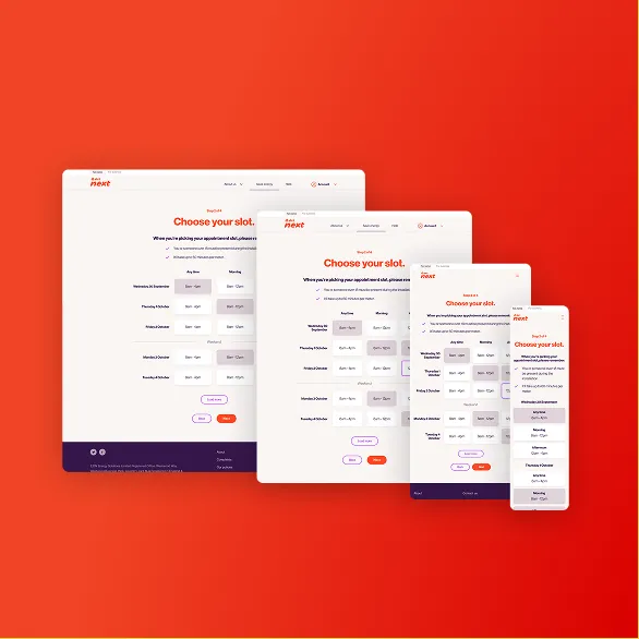
User interface design for an appointment booking system showing a 'Choose your slot' page displayed on four devices of different sizes: desktop, tablet, small tablet, and smartphone, all on an orange background.
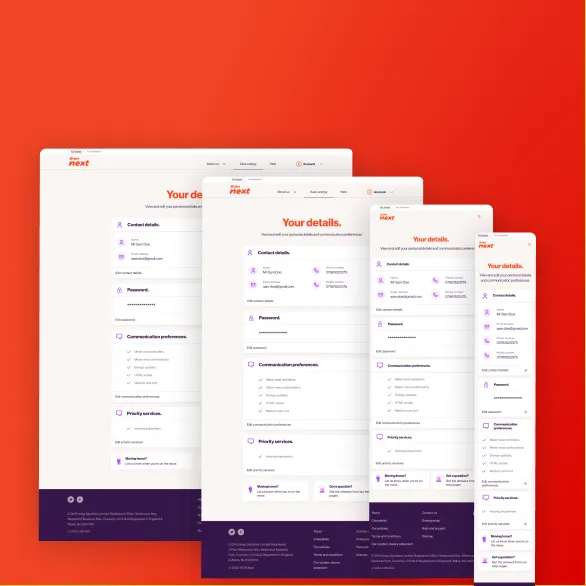
Four overlapping responsive web page layouts of a user details form displayed on screens of different sizes against a red background, showing sections for contact details, password, communication preferences, and priority services.
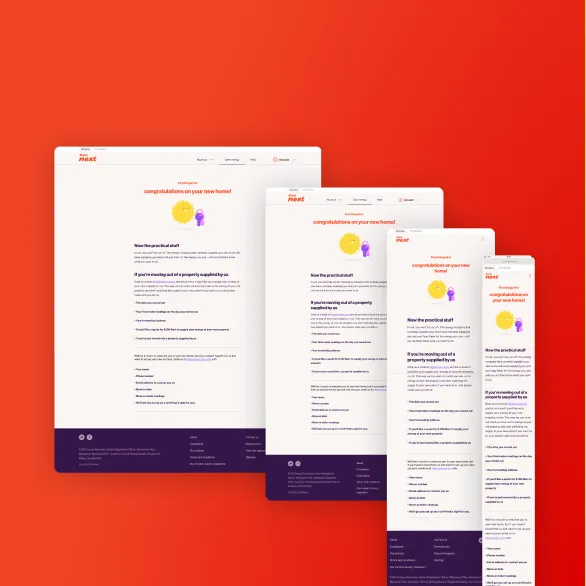
Four overlapping screenshots of a website page titled 'congratulations on your new home!' from a company named Next, showing practical information and guidance for new homeowners on a white background with orange and purple design elements, displayed in different responsive layouts from large desktop to small mobile view on an orange-red gradient background.
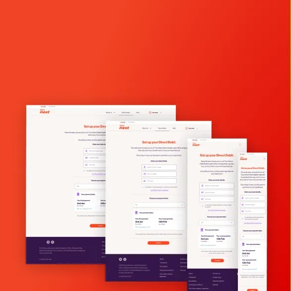
Four overlapping screenshots of a website's Direct Debit setup page in desktop and mobile views, displayed against a red gradient background.
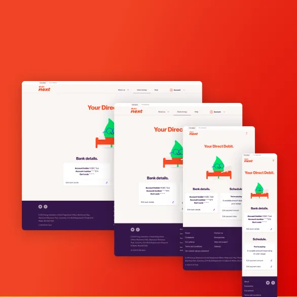
Screenshots of a banking website for setting up direct debit, shown on desktop, laptop, tablet, and smartphone screens with a red background.

This only scratched the surface.

we weren't just applying the brand to wireframes. We were stress-testing the visual language by applying it to scenarios that hadn't yet been considered.

E.ON NEXT LAUNCH SITE

Making sense of the design system/s

There wasn't a single source of truth for the design system.


We inherited two separate design libraries, both containing a mixture of current and outdated components. Neither could simply be discarded, so it was necessary to work through them to understand what elements were still relevant and what needed to go.


We consolidated the useful parts into a single library the team could rely on, while continuing to design and deliver the product around it.
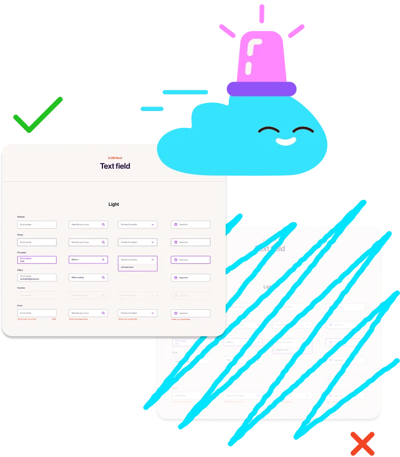
Illustration showing a blue cloud character with a pink siren on its head, smiling. The cloud is positioned between two UI designs of text fields: the left design is clear and marked with a green check, while the right design is crossed out in blue and marked with a red X, indicating the left design is preferred.
E.ON NEXT LAUNCH SITE

One System We Could Rely On

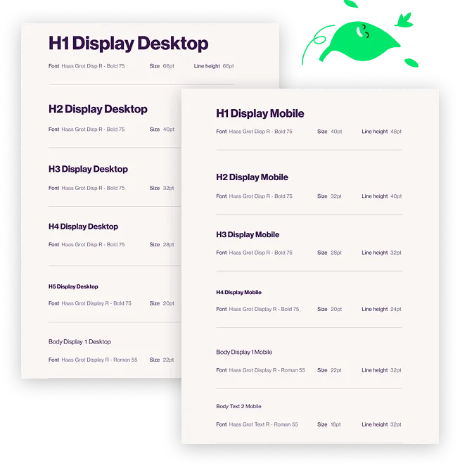
With the two libraries consolidated, we had a consistent library everyone could work from.

Bringing together the core elements of the E.ON Next digital experience.

The new shared library could continue to evolve alongside the product, forming the building blocks of an evolving design system.

Importantly for us, it gave us consistency across the product without getting in the way of delivery.
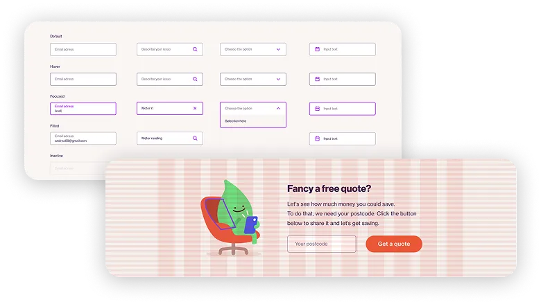
User interface elements showing various text input states: default, hover, focused with text and icons, filled, and inactive, alongside a UI banner with a green leaf character sitting on a red chair holding a tablet, invitation text for a free quote, a postcode input box, and an orange 'Get a quote' button.
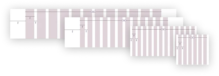
Five overlapping browser window mockups showing a vertical grid layout with alternating light and pinkish vertical columns and small label text.
Two typography specification sheets side by side showing font names, weights, sizes, and line heights for desktop and mobile displays with headers and body text styles using the Haas Grot typeface.
Row of purple outline icons including search magnifying glass, chat bubble, envelope, phone receiver, logout arrow, external link, upload arrow, down arrow, left and right arrows, up arrow, close X, credit card, information circle, British pound sign, pound sign crossed out, checkmark, left and right arrows, user silhouette, volume off, volume on, play button, and pause button.
E.ON NEXT LAUNCH SITE

Launching & Scaling

The first release of the E.ON Next site launched on time, despite the tight deadline.

It formed a substantial part of the platform used to migrate more than one million nPower customers to E.ON Next.

The platform continued to grow after launch, eventually serving more than 6.5 million customers and contributing to a reported £1m-a-day reduction in operating costs.

150+

Initial migration of 1m+ nPower customers

30,000+

Customers served as the platform scaled

4.4/5

Reported reduction in operating costs

A green leaf character sitting on an orange swivel chair, holding and looking at a blue smartphone, with a steaming red mug on a white side table next to it.
E.ON NEXT LAUNCH SITE

A New Focus

A later sprint explored how some of the core journeys could translate into a native app.

Working closely with UX, we developed prototypes that explored how a native app could offer a more focused experience than the web, making specific tasks such as submitting a meter reading easier to complete.


We tested different approaches with existing E.ON Next customers, using the findings to understand where a dedicated app could add value.
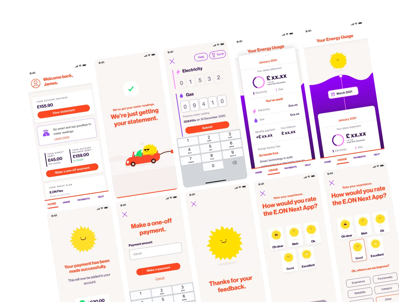
Series of smartphone screens showing the E.ON Next mobile app user interface, including account balance display, meter reading input for electricity and gas, energy usage summaries for January and March 2021, one-off payment form, payment success confirmation, and user rating prompts with smiley sun icons representing satisfaction levels.
E.ON NEXT LAUNCH SITE

Reflection

Looking back, this project probably taught me more than any other about the difference between a good design process on paper and what it takes to actually deliver one in practice.


Things don’t always happen in the ideal order, but in this instance they didn't need to. 
We had a team willing to share ownership, communicate and make sensible decisions with the information we had.

Sometimes forward momentum is more important than getting everything perfect on the first try.
Illustration of five colorful cartoon shapes with smiling faces grouped together like a cheerful selfie, including a yellow sun with rays, a green leaf, a blue cloud, a pink triangle, and a purple triangle.
Bright yellow, stylized sun with sharp triangular rays radiating evenly around a circular center.
Keep Exploring
Contact me...