
What began as a broad brief eventually led us to rethink the role of the homepage and explore how customers find what they need.
Role:
UI Design, with additional UX
Team:
UI | UX | Product/Delivery | Engineering
Agency
Somo
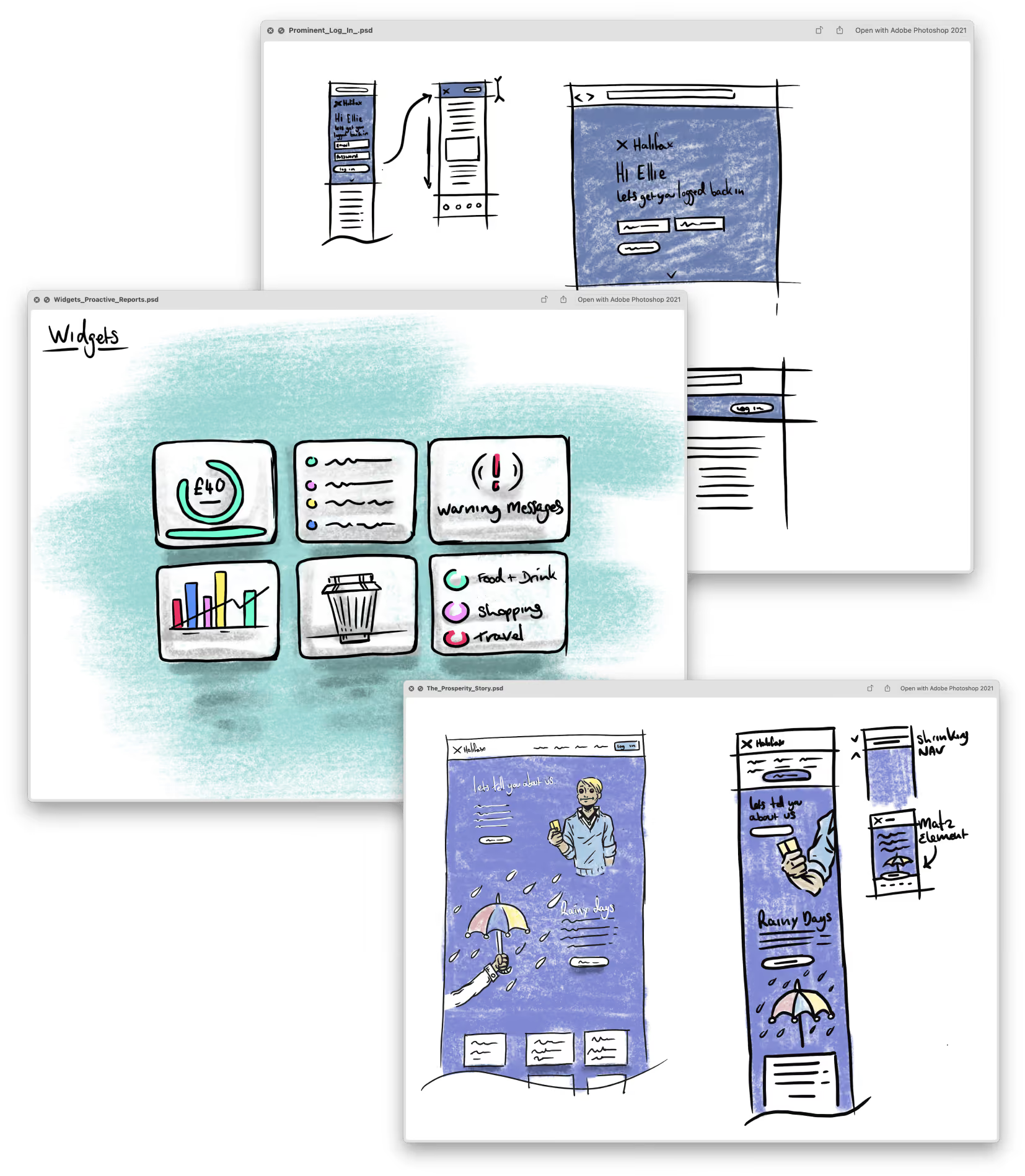
Halifax asked Somo to help them identify where technology could be used to solve business and customer pain points across its digital experience.
Working closely with the client, we ran a series of exercises to understand those pain points, alongside the needs and priorities of the business. The team generated a range of possible responses, which I quickly visualised as sketches so we could discuss, challenge and develop them together with Halifax.
Through that process, we identified the areas where we thought we could make the biggest difference.
Our research showed that while the homepage was packed with content, very little inspired customers to discover more. It raised a more fundamental question for the team:
What was the homepage actually there to do?
The existing homepage was trying to serve a lot of different needs. Different areas of the business wanted to be represented, but the analytics showed that much of the content was receiving very little engagement.
That created a tension between what customers were actually using and what the organisation felt needed to be there.
Rather than assuming everything deserved equal prominence, we started looking at what customers were actually coming to the homepage to do.
We started the sprint with dedicated UX resource, but lost two UX designers along the way.
Rather than letting that stall the project, the remaining team picked up what needed doing between us.
My main responsibility was still UI and visual design, but I became much more involved in working through the UX as the concept developed.
It wasn't how we'd planned to work, but for a conceptual project it worked surprisingly well. We made decisions together, moved quickly and kept the idea developing.


The existing homepage was organised around Halifax's products and services, asking customers to work out where they needed to go to find what they were looking for.
We explored a different approach that started with the customer's intent. Rather than decoding where they needed to go, they could simply tell Halifax what they were trying to accomplish.
Search would be at the core of the experience, with minimal additional UI competing for attention.
The existing homepage was trying to serve a lot of different needs. Different areas of the business wanted to be represented, but the analytics showed that much of the content was receiving very little engagement.
That created a tension between what customers were actually using & what the organisation felt needed to be there.
Rather than assuming everything deserved equal prominence, we started looking at what customers were actually coming to the homepage to do.
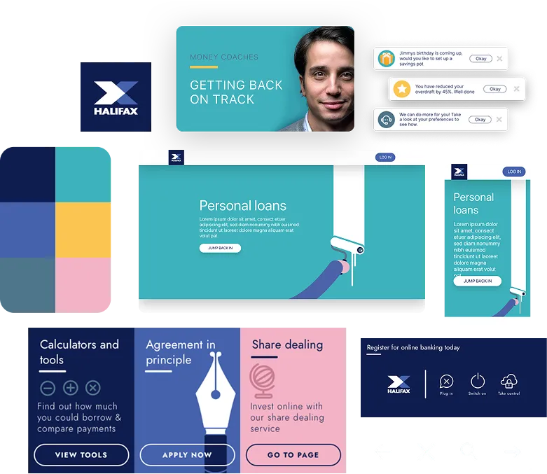
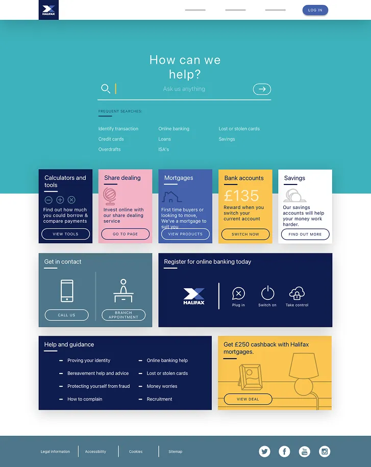
To test the concept beyond the homepage, we built a prototype around the Mortgage Calculator journey.
Starting from search, we explored how someone could navigate the site by expressing what they needed. This would provide a direct route into a useful tool without the customer having to work their way through multiple sections of the site.
The aim wasn't to create something production-ready, but to show how the principles we'd established for the homepage could extend across the broader Halifax experience.
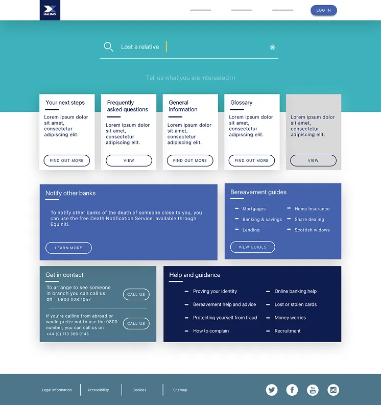
The Mortgage Calculator gave us a useful journey to build the concept around, but we also wanted to understand how the same approach would work for less frequent needs.
Analytics could tell us which journeys were used most often, but frequency couldn't be the only measure of what deserved attention.
One stakeholder raised the example of someone dealing with the death of a family member. It might represent a much smaller proportion of visits, but when someone needed that help, finding it easily really mattered.
We explored a bereavement journey to see how the same search-led approach could respond to a very different customer need.
We deliberately reduced the use of colour and imagery to give the experience a more restrained visual treatment that felt appropriate for the context.
Once we'd developed the concept, we presented the prototype back to Halifax, using it to bring the North Star vision to life and show how the experience could work beyond individual screens.
The team we worked with saw the value in the concept, and were keen to develop it further. However, getting an organisation the size of Halifax to adopt such a significant change would prove to be a stretch too far.
While the project was never adopted by the wider organisation, Halifax used the research and thinking to help inform its digital strategy over the following 18 months.
I came into the project primarily responsible for UI and visual design, but circumstances meant I became much more involved in the UX and wider thinking behind the concept.
It gave me more confidence working outside the boundaries of my immediate role and reinforced how much I enjoy being involved in shaping an idea, rather than pure execution.
The design itself was never adopted, but the thinking behind it still had an impact. The value of this project wasn't in whether it went into production, but in how it helped move the conversation forward.