
Škoda Sales Aid, a sales companion for exploring and configuring the entire Škoda range.
Role:
UI Design
Team:
UI | UX | Product/Delivery | Engineering
Agency
Somo

For this project, the design team was kept purposely lean. Working alongside a UX designer, I was responsible for leading the UI effort across the entirety of the app.
At the same time, Škoda UK was introducing a new visual direction. The brand guidelines established the foundations, but hadn't yet considered how they would work within an app.
Part of my role was translating those principles into a digital sales tool that needed to work across the entire vehicle range.
This meant establishing a consistent visual language for the app, while allowing individual models room to display their own personality.




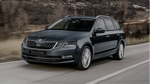

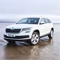
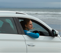
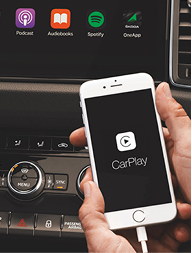
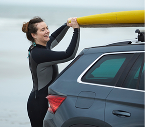
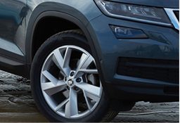
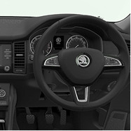


The new visual direction placed much greater emphasis on lifestyle photography, presenting Škoda's vehicles in environments that reflected how customers might actually use them.
Rolling that direction out across the entire range took time. Lifestyle shoots had to be organised model by model, meaning some vehicles already had extensive new photography while others still relied more heavily on traditional imagery and renders.
The challenge was making the most of the available photography while maintaining a consistent experience across the entire range.
My initial approach leaned heavily into the new brand direction, using lifestyle photography to bring more personality into the range.
Feedback from the Škoda team highlighted an important practical consideration: in a sales environment, individual models needed to be recognisable at a glance.
My initial approach leaned heavily into the new brand direction, using lifestyle photography to bring more personality into the range.
Feedback from the Škoda team highlighted an important practical consideration: in a sales environment, individual models needed to be recognisable at a glance.
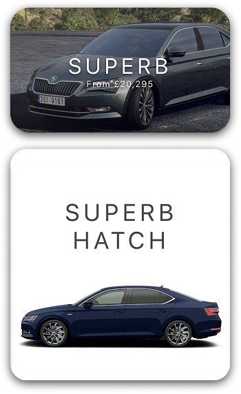
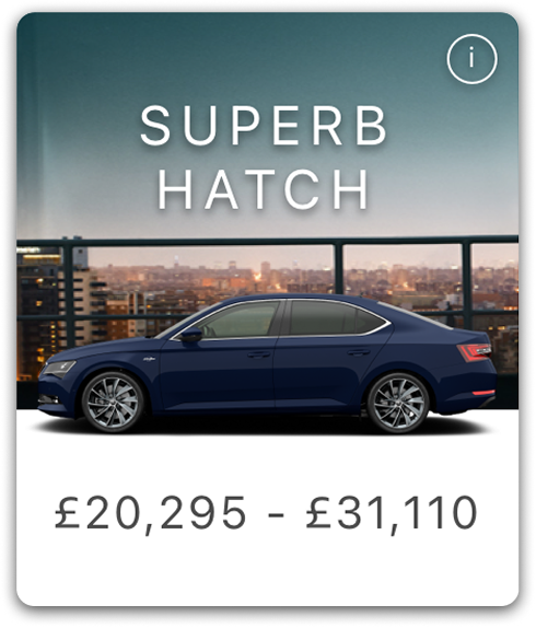
Clean vehicle renders did that far more effectively. Using the renders alone solved the functional problem, but I felt the result became too sterile and clinical.
The final approach combined both ideas: a consistent vehicle render for immediate recognition, supported by photography that brought back the warmth and aspirational quality of the new visual direction.
I began experimenting with ways to introduce more character, initially using blocks of colour and gradients before exploring the lifestyle imagery itself as a backdrop.
Clean vehicle renders did that far more effectively. Using the renders alone solved the functional problem, but I felt the result became too sterile and clinical.
I began experimenting with ways to introduce more character, initially using blocks of colour and gradients before exploring the lifestyle imagery itself as a backdrop.
The final approach combined both ideas: a consistent vehicle render for immediate recognition, supported by photography that brought back the warmth and aspirational quality of the new visual direction.
My initial approach leaned heavily into the new brand direction, using lifestyle photography to bring more personality into the range.
Feedback from the Škoda team highlighted an important practical consideration: in a sales environment, individual models needed to be recognisable at a glance.
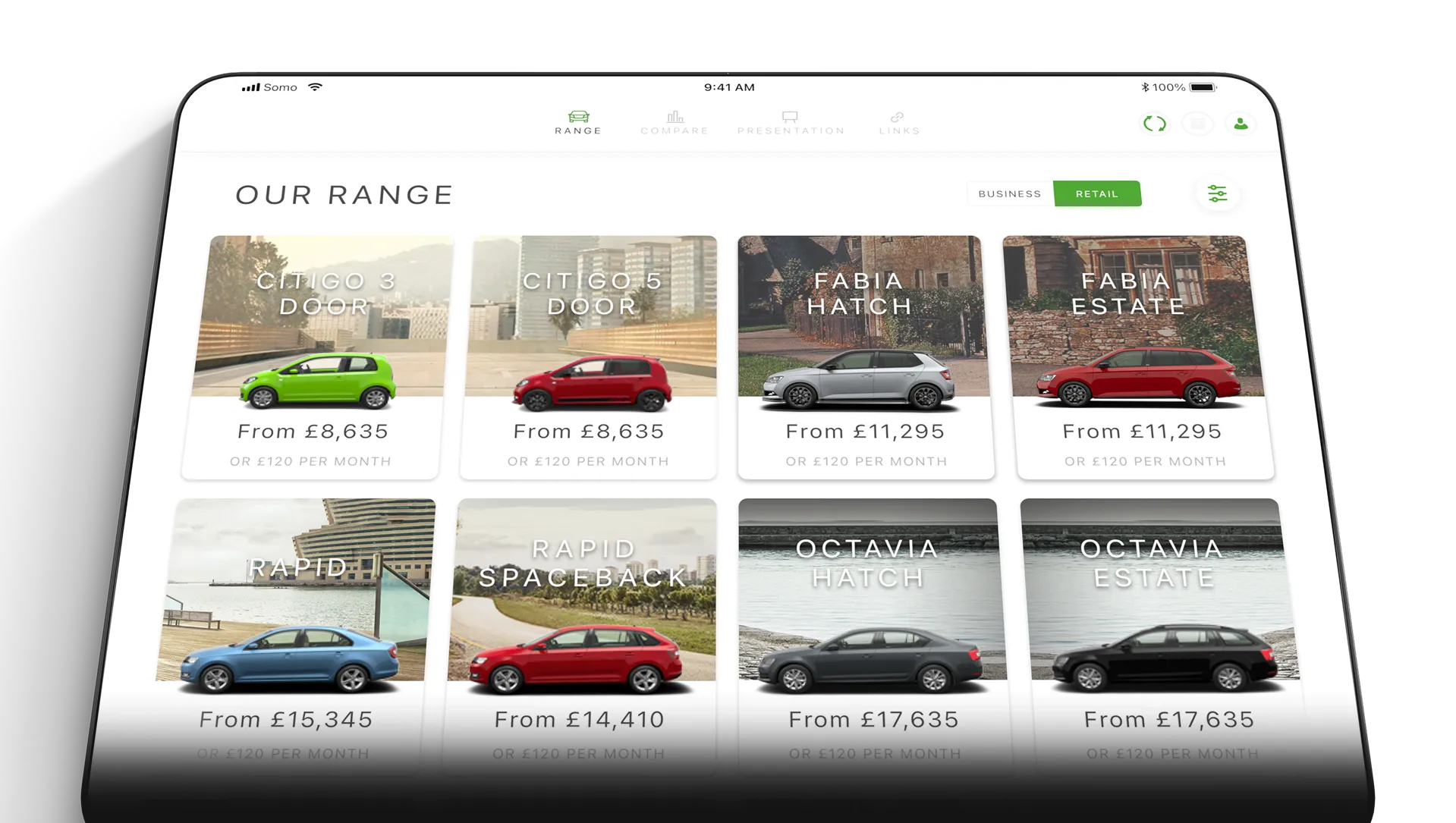
The next challenge was organising the sizeable amount of product information visually without overwhelming the customer, balancing aspiration with technical information.
The experience needed to work at different levels of detail. A salesperson could move from exploring the wider range into an individual model, easily revealing features and specifications as the conversation developed.
Progressive disclosure of information kept the experience focused, allowing detailed information to remain close at hand without distracting from the vehicle itself.
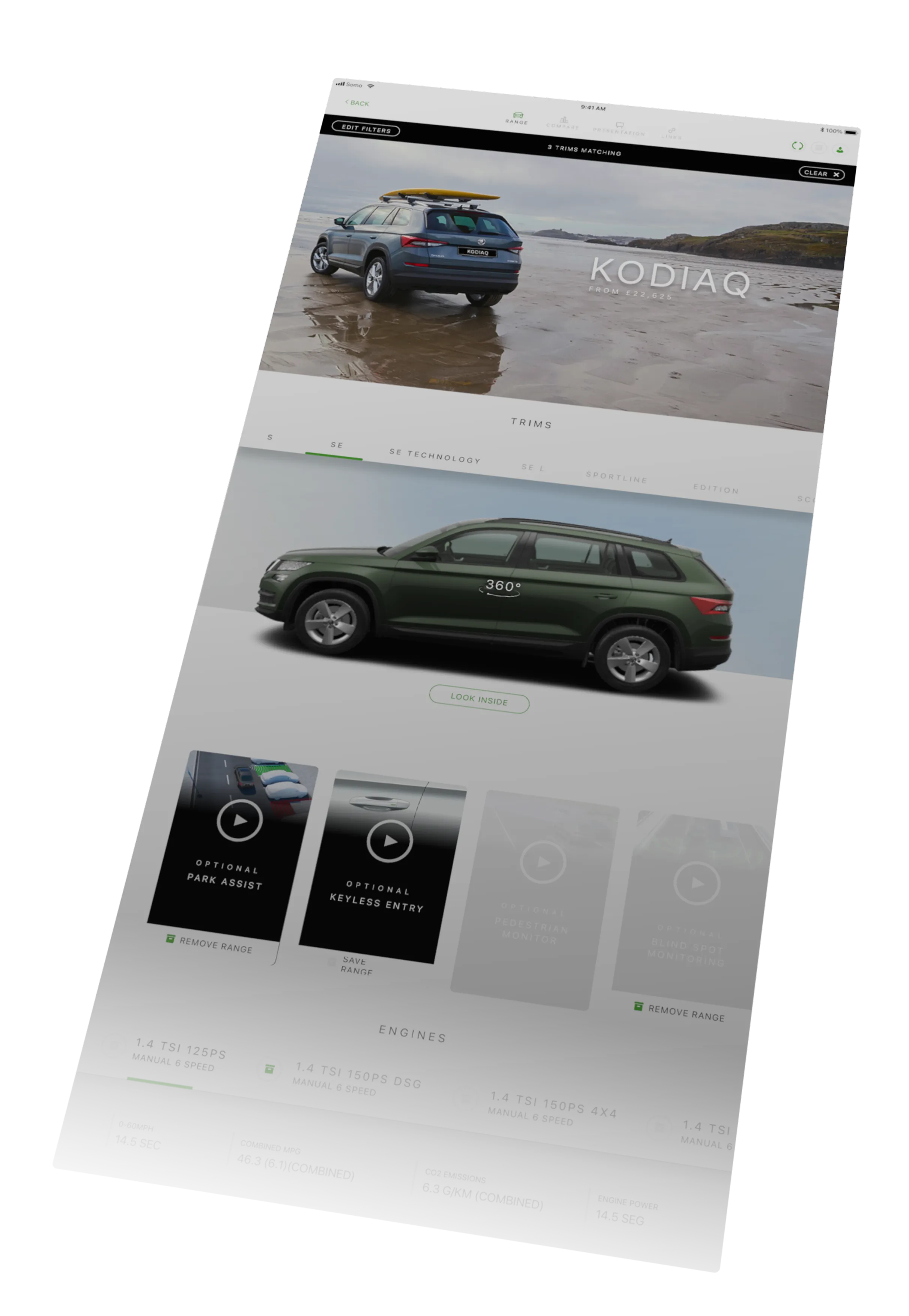
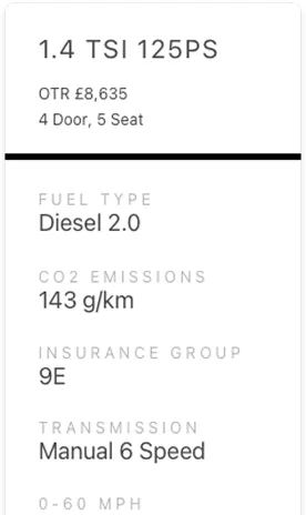
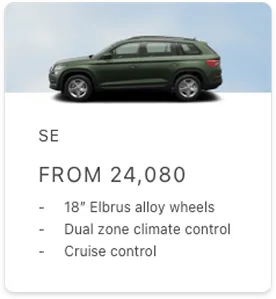
For customers who didn't already have a particular model in mind, filtering provided another route in, narrowing the range around practical requirements such as price, style, efficiency, performance and features.
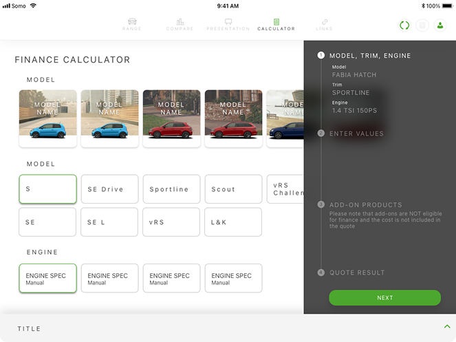
Exploring the range was only part of the sales conversation. Once a customer had found a vehicle they were interested in, the app also needed to help them understand whether it worked for them financially.
The finance calculator allowed the salesperson to build a quote around the customer's chosen model, adjusting variables such as mileage, payment period and deposit.
We designed the process as a guided interaction, breaking potentially complicated financial information into a series of simple decisions. Rather than confronting the customer with everything at once, information was progressively revealed as it became relevant.
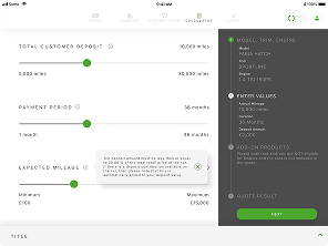
We designed the process as a guided interaction, breaking potentially complicated financial information into a series of simple decisions. Rather than confronting the customer with everything at once, information was progressively revealed as it became relevant.
Exploring the range was only part of the sales conversation. Once a customer had found a vehicle they were interested in, the app also needed to help them understand whether it worked for them financially.
The finance calculator allowed the salesperson to build a quote around the customer's chosen model, adjusting variables such as mileage, payment period and deposit.
Choosing between vehicles meant looking beyond the initial purchase price. The comparison tool allowed customers to put Škoda models alongside competitor vehicles to understand the differences that matter over the course of ownership.
Rather than reducing the decision to a list of specifications, we organised the information around comparable costs such as fuel, insurance, vehicle tax and total running costs, making it easier to understand where each vehicle differed.
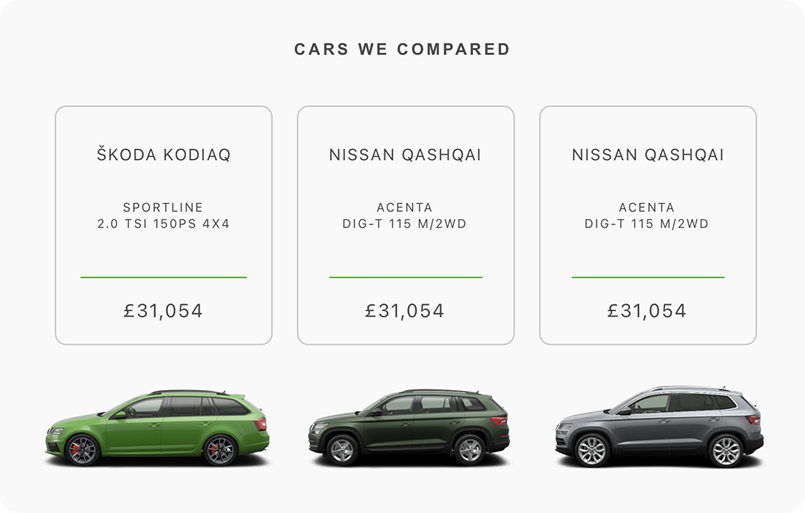
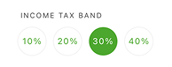

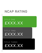



Presenting that information transparently showed confidence in Škoda's offering. It also gave salespeople a straightforward way to talk through the differences with customers, turning a potentially dense set of figures into something easier to understand at a glance.
Exploring the range was only part of the sales conversation. Once a customer had found a vehicle they were interested in, the app also needed to help them understand whether it worked for them financially.
Exploring the range was only part of the sales conversation. Once a customer had found a vehicle they were interested in, the app also needed to help them understand whether it worked for them financially.
Exploring the range was only part of the sales conversation. Once a customer had found a vehicle they were interested in, the app also needed to help them understand whether it worked for them financially.
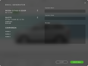
The sales experience didn’t end when the customer left the dealership. The app brought together the information discussed during their visit and sent it to them as a personalised follow-up.
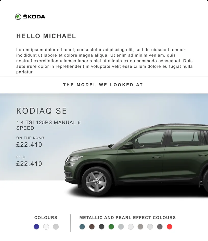
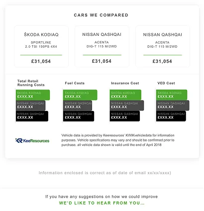
Rather than receiving a generic brochure, customers were given the opportunity to revisit the specific models they'd explored, including their chosen specification, colours and features, alongside information from comparisons made during the conversation.
This created a useful record of the visit for customers return to later, while also giving the salesperson a natural way to continue the conversation beyond the showroom environment.
The sales experience didn’t end when the customer left the dealership. The app brought together the information discussed during their visit and sent it to them as a personalised follow-up.
Rather than receiving a generic brochure, customers were given the opportunity to revisit the specific models they'd explored, including their chosen specification, colours and features, alongside information from comparisons made during the conversation.
This created a useful record of the visit for customers return to later, while also giving the salesperson a natural way to continue the conversation beyond the showroom environment.
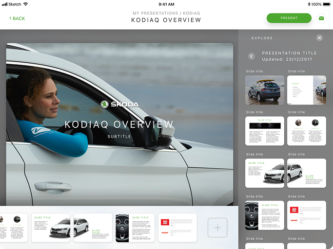
In time the app evolved to work beyond the traditional showroom environment. Fleet sales introduced a different scenario, where salespeople could be presenting Škoda's range to businesses looking to purchase multiple company vehicles. These conversations required a more structured way of presenting relevant vehicles, features and supporting information.
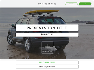
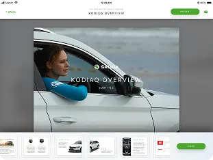
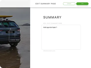
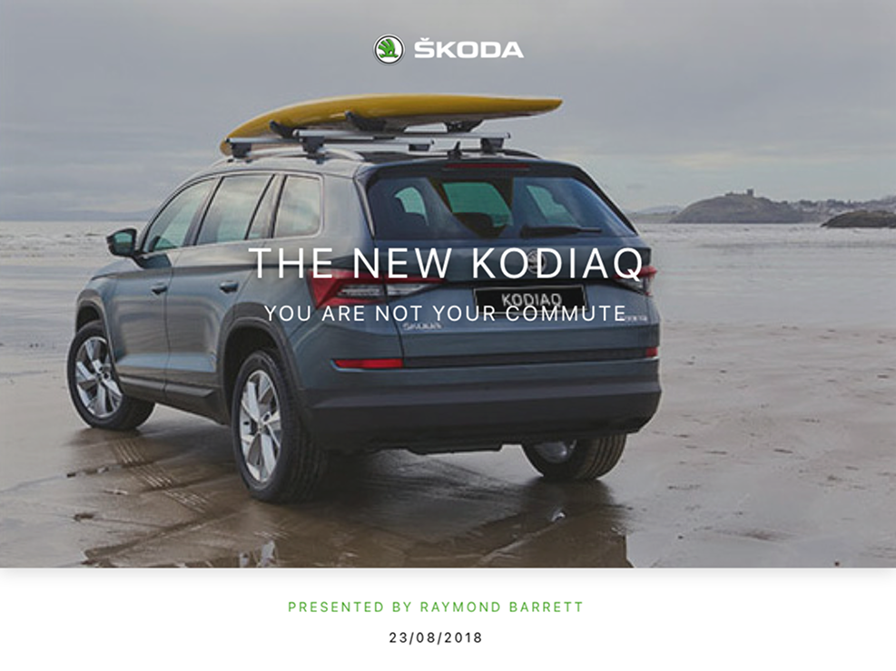
The presentation builder allowed salespeople to assemble approved Škoda content into tailored presentations relevant to particular organisations. Templates could be fully customised, with salespeople able to select and organise the material most relevant to each presentation.
For this project, the design team was kept purposely lean. Working alongside a UX designer, I was responsible for leading the UI effort across the entirety of the app.
At the same time, Škoda UK was introducing a new visual direction. The brand guidelines established the foundations, but hadn't yet considered how they would work within an app.
Part of my role was translating those principles into a digital sales tool that needed to work across the entire vehicle range.
This meant establishing a consistent visual language for the app, while allowing individual models room to display their own personality.
The app was rolled out across more than 150 Škoda dealerships in the UK, putting the product directly into the hands of the salespeople it had been designed to support.
Following launch, the app recorded more than 30,000 hours of use, with Škoda reporting a customer service satisfaction score of 4.4 out of 5.
UK dealerships
UK dealeHours of usage after launchrships
Reported customer service satisfaction
Looking back, what strikes me about this project is that some of its most complex parts were things the customer never needed to see.
At its heart, the app was designed to make life easier for salespeople, while hopefully making the process of buying a new car more enjoyable for the customer too.